In my previous article, I zoomed in on one specific lever: scarcity messages, those “Only 1 room left” badges that reliably nudge users toward certain actions.
We saw something that every product team eventually learns the hard way:
- Tiny UI changes can outperform big backend work
- Users often deny being influenced—while behavior data shows the opposite
- Ethics isn’t optional: fake urgency prints short-term growth and long-term distrust
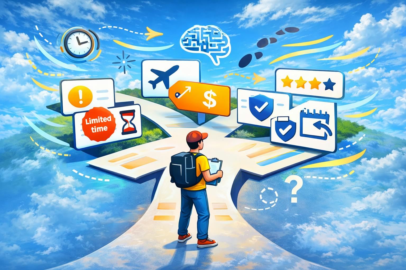
But scarcity is just one tile in a much bigger mosaic. Travel UX is essentially a conveyor belt of uncertainty: Where should we go? Is this safe? Is this overpriced? Will I regret it? What if plans change? And uncertainty is where cognitive biases thrive.
Together with my colleague, Boris Yuzefpolsky, Head of UX Research at Ostrovok, who has been doing research for 10 years, we've decided to dig deeply into the top 12 cognitive biases that affect human decision-making, and explain how to use them correctly in your product
Why travel is the perfect storm for behavioral bias
Almost every industry has biases. Travel has all of them, amplified:
- High price sensitivity
- Emotional context (family, safety, anticipation, fear of regret)
- Complex comparisons (hotels are not identical products)
- Time pressure (flights, visas, seasons, dynamic pricing)
- Massive choice sets (hundreds of similar options)
In theory, the user compares alternatives and chooses rationally. In reality, users:
- Buy “just in case” insurance
- Choose bestsellers because they’re labeled so
- Over-index on one scary review
- Postpone decisions until they abandon
- Make impulse purchases and immediately seek cancellations
Biases directly affect business outcomes: CTR, conversion, AOV/ARPU, cancellations, support load, CSAT/NPS, and retention.
And the line between ethical nudges and dark patterns is thinner than most teams admit, so let’s widen the lens
A practical mental model: biases appear where uncertainty spikes
Across the travel journey, uncertainty spikes at predictable points:
- Inspiration (Where should we go?)
- Search/listing (Too many options)
- Details (Can I trust this?)
- Checkout (Am I making a mistake?)
- Post-purchase (Will I regret it?)
- Trip execution (Stress + distractions)
Biases cluster around those spikes. So instead of treating biases like trivia, treat them like systemic forces you can map, measure, and design for.
The field guide: 12 cognitive effects you meet in travel UX
1) Anchoring
What it is: The first number you see becomes a reference point, even if it’s arbitrary
How it shows up in travel:
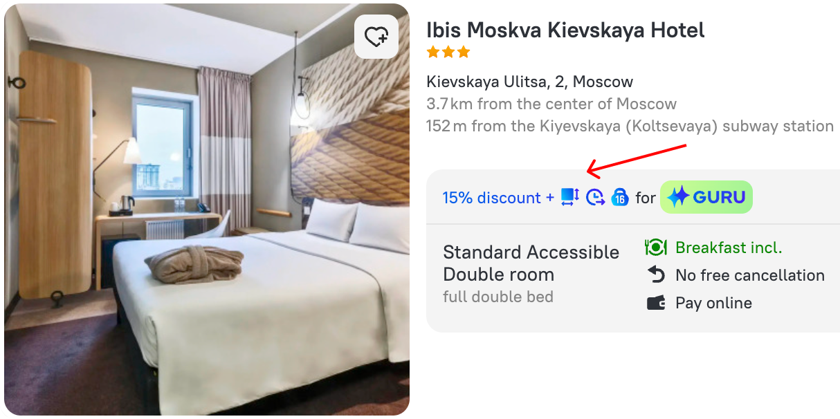
Strikethrough prices, “Was/Now”, “Average price”, "From X”, “Only today” etc. Once the brain latches onto $200, $140 feels like a win, regardless of the market
How to diagnose:
- A/B: price with anchor (old/struck price) vs without
- Ask users about what’s a normal price here, before showing price (price perception survey)
- Test ordering: expensive-first vs cheap-first (anchoring works through layout too)
What it moves:
- Conversion rate (CR)
- Average order value (AOV)
- Perceived value in surveys (PV)
Ethical use:
- Show only real historical prices
- Explain why price changed (partner rate, seasonal shift)
- Consider average market price only if your benchmark is genuinely accurate

2) Social proof
What it is: When unsure, we copy others, especially people like me
How it shows up:
“Popular with families” “Booked 27 times today”, "Rates 1 in this area”
How to diagnose:
- Reverse A/B: remove badges and compare CTR to item page
- Segment impact: new users vs returning; family vs solo; domestic vs international
- Measure whether social proof reduces review-reading (a sign it’s resolving uncertainty)
What it moves:
- CTR to PDP (property detail page)
- CR for new users
- Time to decision
- Review interaction rate
Ethical use:
- Make it specific: "Popular among families with kids under 6,” not just "Popular"
- Don’t fabricate “X people are viewing right now” unless it’s true and defined clearly
- Treat social proof not as a pressure, but as the navigation help
3) Confirmation bias
What it is: We seek evidence that confirms our belief and discount contradictions
How it shows up:
Users firstly decide whether a service is good or bad, and only then skim only positive reviews, ignoring recent complaints
How to diagnose:
- Reorder review snippets (negative-first vs positive-first) and observe impact on confidence + CR
- Track use of lowest rating filters vs highest rating
- Interview question: What made you trust this source/phrase?
What it moves:
- Depth of review scroll
- Confidence perception
- Post-stay NPS gaps (expectation vs reality)
Ethical use:
- Provide a balanced picture view (common pros/cons)
- Highlight critical constraints clearly (noise, stairs, renovation)
- Honest comparisons beat “lossy persuasion long-term
4) Probability bias
What it is: People overweight vivid rare risks and underweight boring common risks
How it shows up:
One turbulence story results in a conclusion that planes are unsafe, while a dangerous mountain drive feels normal in checkout, anxious users cling to cancellation policies and insurance
How to diagnose:
- Look at insurance uptake before/after major news events
- Test tone: anxious copy versus neutral copy
- Observe cancellation-policy interactions (hover, expand, scroll) by segment
What it moves:
- Insurance attach rate
- CR and cancellation rate
- CSAT around communications tone
Ethical use:
- Put stats in context (without fear-mongering)
- Use calm and precise language
- Make policy terms readable, not a legal trap
5) Framing + the “Zero price” effect
What it is: Wording changes perceived value. The word "Free” is disproportionately attractive even when economically equivalent
How it shows up:
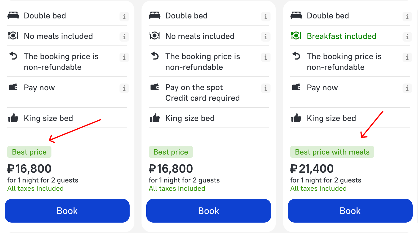
Breakfast for €7 feels like a loss, but breakfast included for free — feels like a win!
How to diagnose:
- A/B test these messages: "Included in price", "Free” and “Discount applied”
- Price perception survey: which phrasing feels trustworthy vs manipulative?
- Interview: does the item which is free feels like a bonus or a red flag?
What it moves:
- CTR to checkout
- Conversion
- ARPU (sometimes down if free item devalues upsells)
Ethical use:
- If it’s not a gift, say included, not free
- Ensure the checkout clarifies what is included

6) Price = quality (price–quality heuristic)
What it is: When unsure, people treat higher price as a proxy for higher quality
How it shows up:
Users pick a slightly more expensive hotel to avoid risk, even when reviews are similar. Price becomes a shortcut for trust
How to diagnose:
- Experiment with sorting defaults (not always price)
- Compare click distribution across price tiers
- Ask: "Why this option?", and count the answers like "It's more reliable"
What it moves:
- Price-tier distribution
- Premium conversion without matching NPS uplift (warning sign)
- Refund/cancel due to unmet expectations
Ethical use:
- Make differences concrete: area, room size, amenities, distance, view
- Avoid visually crowning pricier options unless objectively justified
7) Authority effect
What it is: Badges and expert picks create trust
How it shows up:
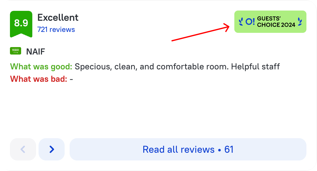
“Traveler’s Choice”, “Hotel of the Year”, “Recommended”, “Best in district”
How to diagnose:
- Remove authority badge and measure CR change
- Test “recommended by users” vs “recommended by experts"
- Track mismatch: high conversion + lower post-stay satisfaction
What it moves:
- CR
- Retention and NPS (if authority overpromises)
Ethical use:
- Always show the source and criteria.
- Separate awards (external) vs internal badges (your algorithm)

8) Survivorship bias
What it is: We learn from success stories and ignore failures
How it shows up:
Users ask friends only about the trips that were amazing, not about what went wrong. Products do the same: highlight happy paths, hide failure modes
How to diagnose:
- Analyze drop-offs and cancellations as first-class signals
- Research users who abandoned the funnel
- Map silent pain steps: payment fails, unclear policies, check-in issues
What it moves:
- Cancellation rate
- Payment drop-off
- Support contacts and negative reviews
Ethical use:
- Design for failure states explicitly
- Show tradeoffs honestly: “No breakfast, but closer to airport”
9) Dunning–Kruger effect
What it is: Low experience can create overconfidence; users underestimate complexity
How it shows up:
First-time flyers with kids think they’re prepare, and then get hit by sleep/food/noise/stress realities. First-time bookers assume they get it, then make avoidable mistakes
How to diagnose:
- Segment new vs experienced users: error rate, support contacts, refunds
- Task success rate by cohort
- Identify first trip friction loops
What it moves:
- Support load
- First-booking conversion and repeat rate
- Long-term retention
Ethical use:
- Adaptive UX: add contextual help like "Booking for the first time?"
- Use simple checklists and guardrails
10) Distraction / cognitive overload
What it is: Competing stimuli reduce attention and increase errors.
How it shows up:
In airports: kids, bags, documents, noise. In mobile UX: notifications, small screens, dense UI. Users misclick, rage-click, backtrack
How to diagnose:
- Rage clicks, backtracking events, repeated toggles
- Heatmaps and session replays
- Error rates by device/context
What it moves:
- Drop-off on critical steps
- Error rate
- CSAT for checkout
Ethical use:
- Reduce UI noise on payment steps.
- Offer a focus mode experience: minimal distractions where stakes are high
11) Choice overload
What it is: Too many similar options paralyze decision-making
How it shows up:
Listings with hundreds of near-identical hotels create research spiral, which leads to abandonment
How to diagnose:
- A/B: limit visible results or introduce curated sets
- Track correlation: viewed items vs conversion (often negative after a point)
- Measure time to final decision and amount of sessions per booking
What it moves:
- time to final decision
- CR
- Session depth without outcomes (thrashing behavior)
Ethical use:
- Great filters + meaningful clustering
- 3–5 personalized recommendations with clear rationale
- Measure speed-of-decision as a success metric (not only CR)
12) Compromise effect
What it is: With three options, people often pick the middle to avoid extremes.
How it shows up:
“Optimal plan” outsells basic and premium. Users choose “middle insurance” without deep reading because it feels safest.
How to diagnose:
- Change order, labels (“optimal” vs neutral)
- Vary the spread between tiers and watch distribution shift
What it moves:
- Plan mix distribution
- ARPU
- Post-purchase regret (if “middle” isn’t actually best-fit)
Ethical use:
- Label with fit, not persuasion: “Good for families,” “Good for long stays”
- Avoid fake compromises (where middle is engineered to be the only sane choice)

Working with bias: a product checklist
Step 1: Define user segments first
Bias impact is not uniform. New users, anxious travelers, experts, families—react differently. If you analyze average user, you will misread reality
Step 2: Map the whole journey
Biases are not isolated UI widgets, they compound. Scarcity + anchoring + social proof + choice overload can create either helpful clarity, or stress + distrust + churn
Step 3: Prioritize a handful of biases and design experiments
Turn the guide above into hypotheses. A/B tests, surveys, interviews, event analytics—each reveals different truth. And remember: interviews reveal narratives, experiments reveal behavior
Step 4: Measure more than just conversion
Complete picture assembles only when you look on it through a bunch of metrics, not just one
- CR, AOV, insurance attach rate
- Cancellation rate, refunds
- Support contacts
- NPS/CSAT
- Retention
Step 5: Add explicit ethical constraints
Examples:
- Scarcity signals must be fact-based
- Cancellation path must be visible
- Ratings and photos must be honest
- Neutral framing when the user’s welfare is at stake
A quick look at Ostrovok: where we see these effects today
Important: the goal is not to eliminate biases (impossible). The goal is to understand where they help users vs where they harm users, and build a plan around experiments + guardrails
1) Search / start screen
This is where users often begin, and the sense of abundance here can be motivating. But there’s a risk: too much marketing optimism reduces trust. We want to test calmer, more credible wording. Still positive, but less hyperbolic (for ex. “Thousands of verified hotels and apartments worldwide”)
2) Recommendation blocks
Here behavioral patterns can work with users:
- Positive framing can reduce anxiety before choice
- Social proof in popular destinations can reduce uncertainty for users who haven’t chosen a place yet
- Anchors can add context (typical price in this area) if they reflect reality
3) Hotel listing
This is where choice overload and cognitive fatigue peak. Ratings, badges, and price cues can help orientation: Free cancellation / Pay at hotel framing can reduce stress
But density is dangerous: too many icons, filters, and info blocks increase overload
So the work is:
- Test simplified UI variants
- Test different price displays (absolute discount vs %, etc.)
- Audit phrasing that may create unnecessary FOMO or anxiety
- Evaluate impact not only on conversion, but also on cancellations and trust
Conclusion: we don’t design for robots
We design for humans—predictably irrational ones. And we’re not exempt. You can grow conversion by leaning into bias. The easy path is to turn every screen into a pressure machine. The harder path is the one worth building: use behavioral insights to reduce uncertainty, clarify tradeoffs, and support good decisions, without deception. Because in travel, and the same applies to other marketplace as well, the trust is not a metric: trust is the product itself.
[story continues]
tags
