Trust-focused UX is what keeps users calm when a platform asks them to log in, confirm an action, or wait for an update. The best trust signals are not slogans. They are interface behaviors that reduce uncertainty: clear status, verifiable records, predictable navigation, and error handling that prevents panic.
This piece breaks down the patterns that consistently make platforms feel dependable, especially in digital entertainment contexts where users often multitask, check quickly on mobile, and leave fast when something feels off.
Why Users Lose Confidence Fast
Most “trust issues” begin as small moments of doubt. A button feels unresponsive. A page takes longer than usual. A status label is vague. The user does not know whether to wait, retry, or back out.
In high-stakes flows, doubt turns into defensive behavior. People refresh repeatedly, open a second tab to verify, or abandon the session entirely. That is not just impatience. It is a rational response to unclear system feedback.
A platform can be technically stable and still feel unreliable if it fails to answer the questions users care about:
- Did you receive my action?
- What state is it in now?
- How long will it take?
- Where can I confirm what happened?
- What should I do if it fails?
How People Seek Proof When They Are Unsure
Users do not trust interfaces. They trust evidence.
When a screen feels ambiguous, people look for “proof surfaces” that confirm reality. Common proof surfaces include a transaction history, an activity log, a timestamp, a reference ID, or a support path that looks legitimate and reachable.
This is where information architecture becomes a trust tool. If a user cannot locate history, help, or policy context quickly, they assume the platform is hiding something, even if it is not. The result is verification behavior: repeated retries, screenshots, support messages, and cross-checking external sources.
If you want a concrete example of how this thinking translates into editorial UX analysis, the DEV.to case study linked as BYBET walks through trust cues as a product behavior problem rather than a marketing problem. It is useful for seeing how small interface choices change user reactions.
Trust-Focused UX Patterns That Reduce Anxiety
Below are nine patterns that show up across platforms with strong product trust. None of these require a redesign. They require clarity, consistency, and “proof-first” thinking.
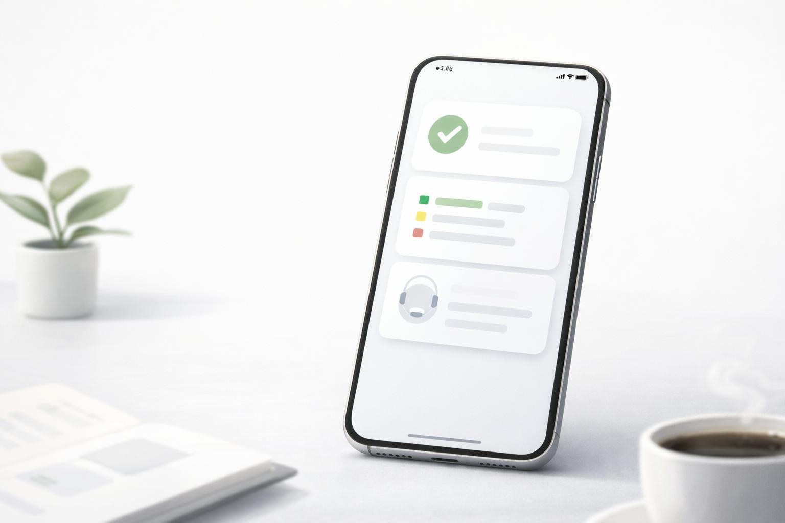
1. State Clarity Beats Endless Loading
Loading states are where trust either holds or collapses. “Processing…” without meaning invites retry behavior, especially on mobile networks where delays are common.
A stronger pattern is explicit state transitions in user language. Instead of one vague spinner, the interface should communicate something like: request received, now processing, completed, or failed with a next step. Users do not need internal pipeline details. They need confirmation that their action exists and is being handled.
2. “Request Received” Is a Critical Moment
Many platforms jump straight from tap to “processing.” That gap is dangerous because the user cannot tell whether the system captured the action. This is when people double-tap, refresh, or resubmit.
A simple acknowledgment that the request is recorded can reduce duplicates and reduce support load. It also lowers cognitive load because the user no longer has to guess whether they should wait.
3. Records Turn Trust Into Something Verifiable
Product trust becomes durable when users can confirm outcomes after the fact. That is why transaction history and activity logs are not secondary pages. They are trust layers.
A good record view is readable and stable. It uses clear labels, timestamps, and consistent status terms. It allows a user to say, “This happened at this time, and here is the reference,” without taking a screenshot to create proof.
Even for platforms that are not finance products, this pattern matters any time a user performs an action they care about: changing account settings, submitting forms, confirming a purchase, or updating preferences.
4. Timing Expectations Reduce Refresh Loops
When people do not know how long something might take, they refresh. When they refresh, they create more confusion.
A trust-friendly UX sets realistic processing expectations without overpromising. It does not need to guarantee a duration. It needs to provide a useful range and a clear place to check status. This is especially important for Philippine users who often rely on mobile data and experience variable latency.
A calm timing message is specific enough to guide behavior, but not so specific that it becomes a promise that can be broken.
5. Freshness Cues Prevent “Is This Stuck?” Anxiety
Many users are not anxious about slowness. They are anxious about staleness.
Freshness cues help users understand whether a page is live, updating, or delayed. The simplest form is a subtle “last updated” signal or a visible status that changes as data refreshes. The key is that the interface should help the user distinguish “nothing changed” from “nothing updated.”
6. Consistent Terminology Keeps Users From Guessing
Users learn your product by pattern recognition. If the same concept is labeled differently in different areas, they assume the system is inconsistent.
A trust-focused platform uses stable terminology for statuses, actions, and records. If you call something “wallet” in one section and “balance” in another, users wonder whether those are different things. That doubt is avoidable.
Consistency is a design system promise: users learn the rules once, then rely on them everywhere.
7. Error Recovery Should Prevent Panic, Not Add It
Generic errors increase anxiety because they give no next move. Worse, some error states quietly encourage risky behavior, like repeatedly retrying without confirming whether an action is already in progress.
A better pattern is error recovery that explains what happened, suggests a safe next step, and points to proof surfaces like history or status pages. When the user knows how to verify, they stop guessing.
A practical rule is that every error should answer: what failed, what you can do now, and how to confirm the result.
8. Support Should Be Discoverable During Sensitive Moments
Support is not only a customer service function. It is a trust signal.
The best platforms make help easy to find at the moment uncertainty appears. That does not mean plastering contact buttons everywhere. It means placing calm, relevant support entry points inside sensitive flows like login, confirmation, and account actions.
If support is hidden behind menus, users interpret the platform as less accountable. If support is visible and specific, users relax even if they do not use it.
9. Microcopy Should Explain “Why” in Plain Language
Microcopy is where trust becomes human.
A short explanation of why the platform needs something can prevent suspicion. This matters for any step that feels intrusive or confusing: verification prompts, permission requests, status labels, or policy notices.
Good microcopy reduces friction by preventing misinterpretation. It replaces “system voice” with clear, respectful language that helps the user understand what is happening.
A Practical Audit You Can Run on Any Platform
If you are analyzing a platform or writing an editorial breakdown, it helps to use a simple audit lens. Focus on whether the interface provides proof at the moments users are most likely to doubt.
Here is a lightweight checklist you can apply quickly:
- Can a user confirm an action was received without retrying?
- Are status labels consistent and understandable across pages?
- Is there a readable history or record view with timestamps?
- Are timing expectations communicated as ranges, not promises?
- Do errors give a safe next step and a way to verify?
- Is support discoverable inside sensitive flows?
- Does the interface signal freshness when data may go stale?
This keeps analysis grounded in user outcomes rather than surface-level aesthetics.
Where Trust Patterns Backfire
Even good trust patterns can fail if implemented carelessly.
Too many statuses can overwhelm users and make the interface feel technical. Overly detailed warnings can increase anxiety instead of reducing it. Excessive confirmation steps can feel like friction if they do not clearly protect the user from risk.
The goal is not to add layers. The goal is to remove uncertainty. A trust-focused UX should feel calm, not busy.
Another common failure is inconsistency: a platform might do state clarity well in one flow but not in another. Users notice. Trust is cumulative, but it is also fragile. One confusing moment can undo many good ones.
Closing Thoughts
Trust-focused UX is not a single feature. It is a system of design choices that helps users verify reality without extra effort. When state transitions are clear, records are accessible, timing expectations are honest, and recovery paths are safe, users stop acting like investigators.
For anyone writing platform analysis or UX breakdowns, this lens is practical because it ties design directly to behavior. You can watch how users respond when something is delayed, unclear, or unexpected. Then you can evaluate whether the product reduces uncertainty or amplifies it.
The most trustworthy platforms do not sound confident. They behave predictably.