In many emerging markets, the entry barrier for traditional e-commerce is simply too high.
You can’t build a typical digital commerce infrastructure in a region where cards are not popular, where cash is still king, and where trust lives inside WhatsApp groups. Also, I regularly face some UX constraints, including low digital trust and mobile-first behavior, influencing my designs.
That’s the reality I first ran into while building Yango Ride in Côte d'Ivoire, the ride-hailing service. Now I'm applying the lessons I've learned to e-commerce.
This article is for product designers, PMs, and founders launching in emerging markets across fintech, e-commerce, and logistics.
Local context
In Côte d'Ivoire, most top-ups happen at agent booths where a person takes your cash and credits your Wave, MTN, or Orange Money wallet on the spot. Money is topped up in small amounts and rarely stored, so people are not used to paying upfront for goods or services.
Sellers, on the other hand, often don’t keep digital inventory or accounting records. This shows how trade and record-keeping in general remain largely offline and fragmented, making it difficult to run a business. For users to adopt digital documentation, there must be a strong incentive, clear value in visibility, or access to new customers that outweighs the friction of changing old habits.
In many fast-growing cities, formal street addressing is patchy, so people default to navigating by POIs because those cues are more reliable than lagging maps. To bridge that gap, platforms are pushing digital addressing. Yet these tools don’t cover all regions. Designing the product interface around how users actually handle addresses is critical for O2O products. Here, I tried to mirror real behavior in the UI by labeling saved locations as “Last used” and offering suggestions like “Near [POI]” so users can anchor delivery near to landmarks. When maps are open, POIs are highlighted more distinctly by using the organizations’ category colors and slightly increasing their size.
And when it comes to buying, search engines or marketplace apps are not where e-commerce begins. People buy from people they know. They discover products in WhatsApp groups or on Facebook pages that their friends recommend. Sellers post WhatsApp catalogs, share Instagram Stories, and DM prices. But for buyers, it’s a gamble: there’s no delivery tracking, no checkout, and often, they need to pre-pay without any guarantee the product will ever arrive.
In my fieldwork across several African markets, I noticed many high-context communication traits, which shape how users perceive, trust, and interpret interfaces. High-context cultures, such as those in many African regions, tend to prefer rich interfaces where meaning is conveyed through color, detailed icons, and contextual cues. In contrast, low-context cultures value clarity, favoring minimalist layouts, strong hierarchy, and direct visual messaging with plenty of white space. If you hesitate about adding a subtitle, err on the side of clarity in designs for high-context cultures.
First misstep
I initially tried applying a mature-market strategy and realized it didn’t match local behavior. Sellers didn’t update inventory, and buyers still bargained in in-app chats of the marketplace and asked for prices already listed. The move was strategically sound in the long run, but too early for a startup, as it took years for Rides to change users' behaviour and prompt the switch to online ride-hailing.
So, the question became: how to start creating real value and revenue right now?
Start where behavior lives
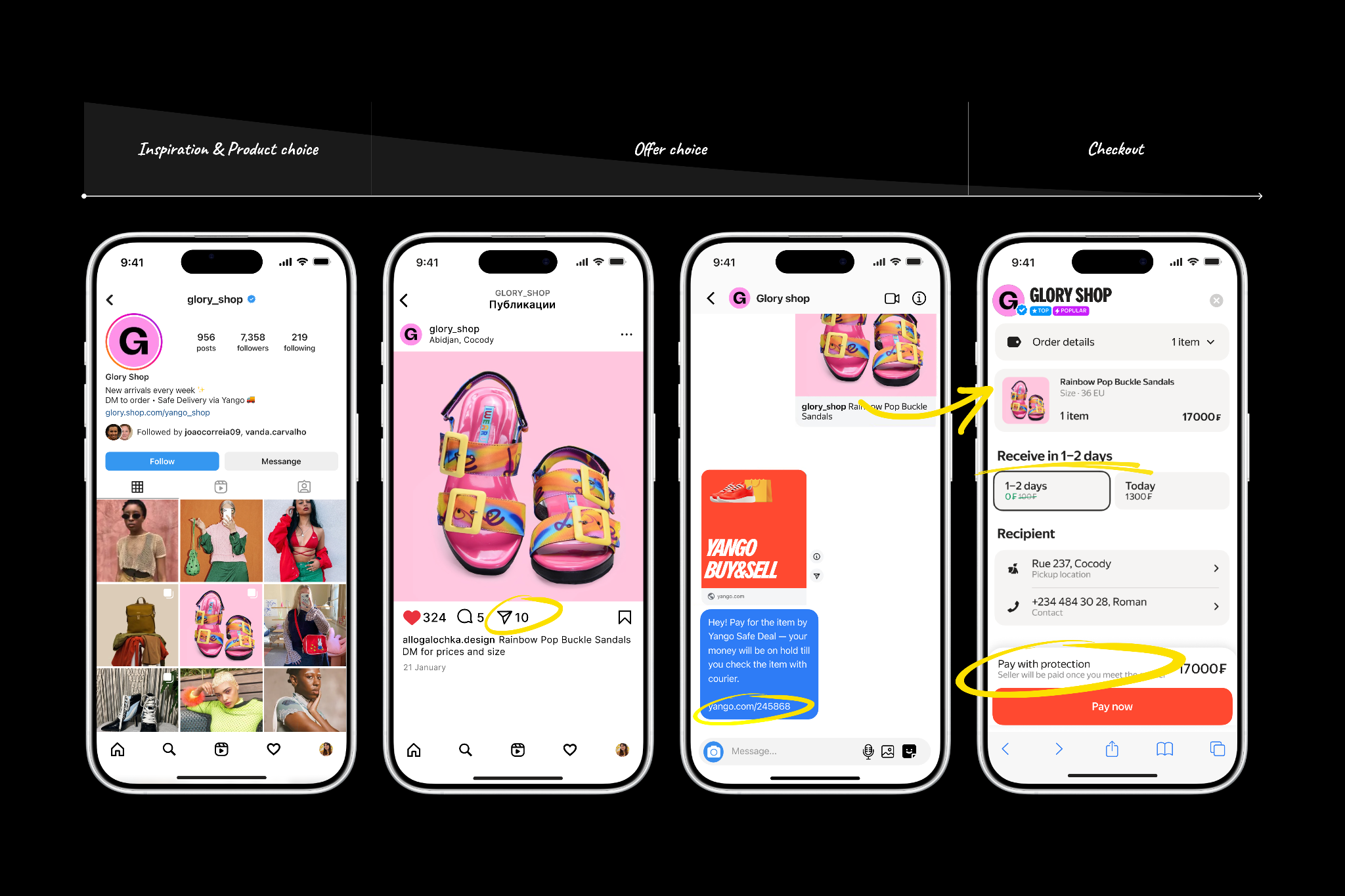
On a field trip, I tried to map the real flow. Sellers confirm availability of items and sizes one-to-one in DMs; buyers often send voice notes describing where to deliver because many neighborhoods don’t have precise street numbers. Then sellers open Yango Delivery, drop a pickup and drop-off pin, quote a price in chat, and the buyer pays in full up front, then waits.
That DM-based flow leaves a trust gap at the riskiest moment in the funnel: unsecured prepayment. Buyers send money on faith, with no escrow, no delivery binding, and no shared state across seller, courier, and buyer.
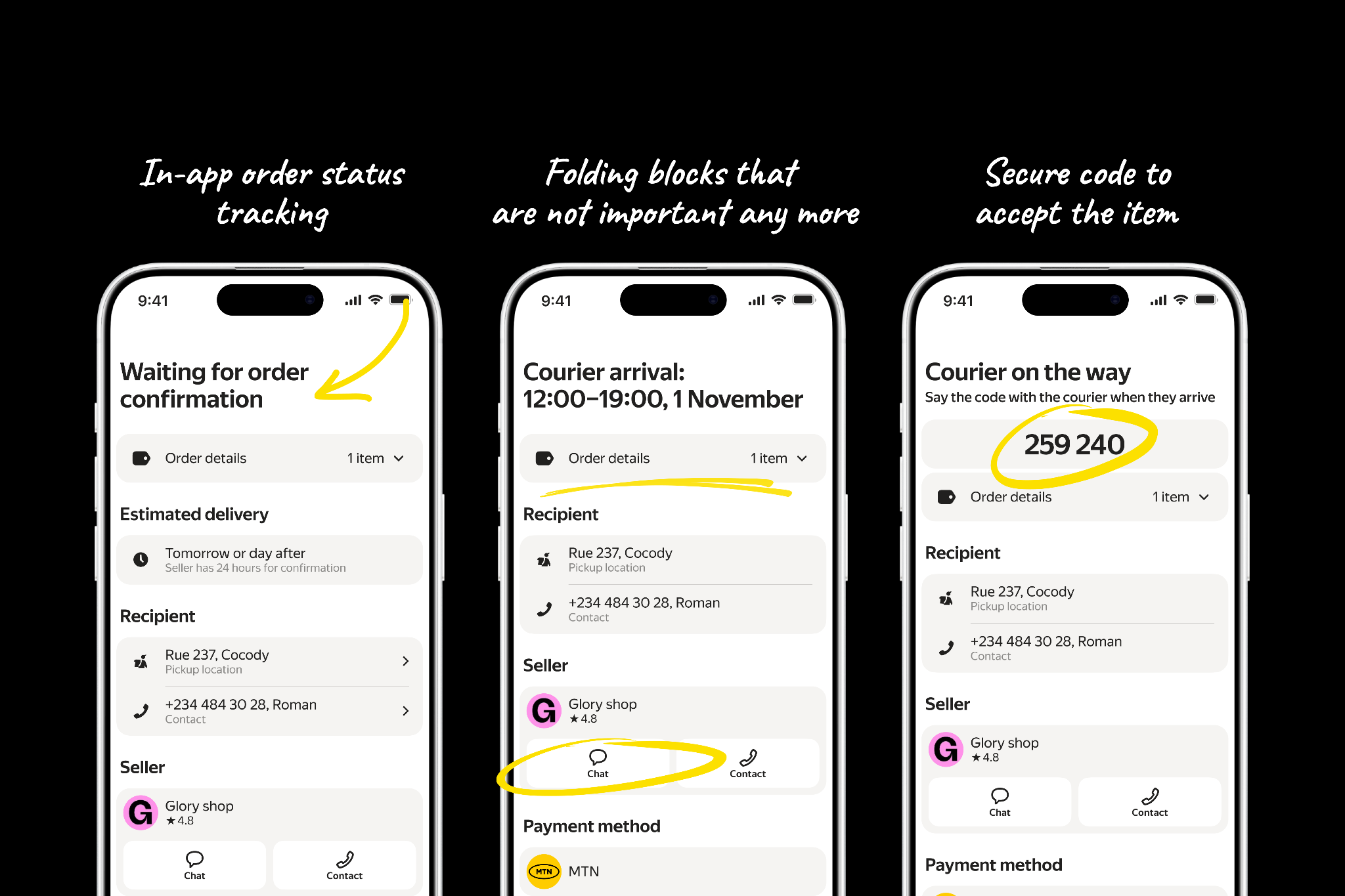
Payment-link flow launch fits this common use case. Sellers can now generate a one-time payment link and paste it directly into DMs, so buyers can pay securely with Safe-Deal Checkout. Safe Deal Checkout holds the buyer’s funds in escrow until the buyer inspects the item at the door and shares a one-time confirmation code (OTP) with the courier. Entering the OTP releases the payout to the seller. If the buyer rejects the item, the refund is processed within 48 hours. Everyone has live tracking and a shared order timeline.

As a product designer, my priority was to signal safety and preserve the merchant’s brand on the checkout screen. I placed the store logo and name at the top with trust badges such as “Top Seller” and “Popular Seller.” A sticky footer near the total reads “Pay with protection. The seller is paid only after you meet the courier,” and includes a brief “How it works” primer. If the seller selects an existing item from their shop, I decided to display the item snippet in the order, as this boosts trust because it matches the image from the social post. After payment, the in-app order status lives in the header, since that section is the only part that changes along the timeline.
For core checkout UX, I repeated the most important facts in headings rather than fine print (e.g., “Delivery in 1–2 days,” “Pay online”) because many users in our regions skim and skip small text. This way, scanning the headings alone shows what is set and what can be adjusted without distracting from payment, which reduces friction and improves conversion to purchase. When a courier is requested, the one-time confirmation code appears centered on the screen to make it unmistakable. In the seller widget, I keep direct contact (in-app chat and a phone number), as sellers often know the product best and can help quickly.

Within eight weeks, nearly half of commerce orders flowed through the payment link, because these orders were incremental rather than cannibalizing the marketplace, and total volume doubled.
The feature became the arbiter of trust between buyers and sellers. I didn’t try to replace social media discovery. Sellers still drive demand through WhatsApp and Facebook. Instead, I solved the most painful part of the funnel: checkout and delivery.
From one sharp pain to a platform
In the end, your compass appears to be your users: watch them closely, go on the ground, and hunt for the moments that hurt in their everyday flow. It starts in the field by subscribing to local sellers, conducting UX research, making Figma prototypes in fields and testing them iteratively, chatting with couriers, and ordering products yourself to see where the pain really is. Field trips build empathy dashboards can’t. If you’re in a startup, resist the urge to boil the ocean; ship the simplest fix to the sharpest pain, prove it works, and then layer the infrastructure of features, ops, and partnerships. Around that small win until it becomes the system.
[story continues]
tags
