TL;DR —
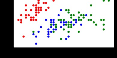
We'll be implementing various data visualization techniques on the 'iris' dataset. The most common types of plots used in data visualization: Scatter plots, Box plots and Violin plots. The code for pair plots is simple and as follows: The code is simple for plotting the features using Box plots. We'll use matplotlib, Seaborn and lmplot libraries for data visualization. The dataframe is a dataframe and the dataframe will be transformed into a real world dataframe.
[story continues]
Written by
@afroz-chakure
Enjoys Reading, writes amazing blogs, and can talk about Machine Learning for hours.
Topics and
tags
tags
data-visualisation|data-science|machine-learning|supervised-learning|seaborn|matplotlib|data-analysis|latest-tech-stories|web-monetization
This story on HackerNoon has a decentralized backup on Sia.
Transaction ID: hNFWtSKPcVPSt0ERVIr2gFtaUKY2DkUV-iSdBU1ttYI