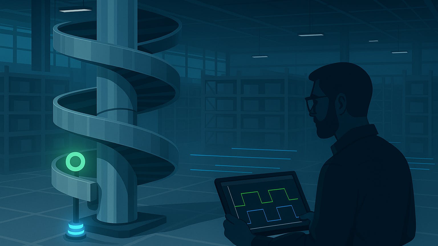
AmbaFlex spiral conveyors are used across facilities to vertically transport products between levels. They’re compact, space-saving, and essential for efficient material flow in high-density buildings.
Each spiral uses two proximity sensors that help detect whether the chain is rotating normally. One sensor is located at the top of the spiral near the discharge point — it detects a reflective metal piece known as the 'half-moon.' The second sensor is mounted at the bottom and detects a smaller reference tab called the 'chain marker' attached to the rotating shaft.
As the spiral runs, both sensors send signals to the PLC every time their respective markers pass by. By comparing the timing between these two signals, the PLC determines whether the chain is rotating correctly or if something is off. If both sensors trigger too close together — or not at all — the system interprets this as a potential chain break or mechanical issue and stops the spiral for safety.
When the signals are mistimed — or both fire simultaneously — the PLC may flag a "Broken Chain" fault, which stops the spiral and creates downstream disruption.
Another spiral just faulted — broken chain again. Controls, can you pull up the trend?
If you're in industrial maintenance, you've heard this before.
AmbaFlex spiral conveyors are everywhere in modern facilities. They're reliable — until they're not. And when they break, troubleshooting becomes a guessing game.
Why? Because technicians can’t see what the sensors saw leading up to the fault . No history. No trends. Just assumptions.
So I built something that fixes that — and saves a ton of time.
The Problem: No Sensor History
When a spiral conveyor throws a chain fault, the first question is always: what exactly happened in the seconds before it stopped?
Unfortunately, the built-in LEDs on the proximity sensors only show the current state — not what happened a few seconds ago. Even for controls engineers with PLC access, it’s difficult to reconstruct past behavior without a live trend or historian.
This lack of visibility turns each chain fault into guesswork. When technicians can't resolve it, the Controls Team often gets called in—sometimes for over an hour—just to figure out what went wrong. Without a visual timeline, even minor sensor issues consume valuable engineering time.
The Solution: A Live Trend Dashboard for Every Bed
I built a Python-based AmbaFlex Proximity Dashboard that shows real-time and historical behavior of both sensors — live.
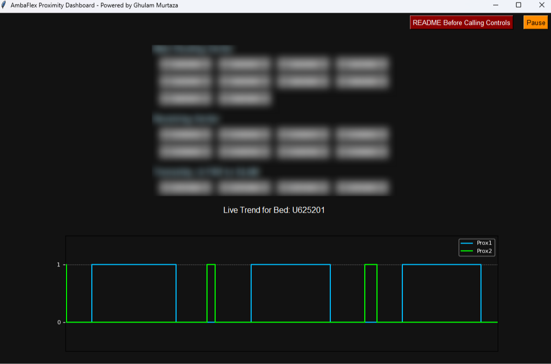
It connects directly to Studio 5000 PLCs via pycomm3, polls proximity sensor tags every 20ms, and stores up to 10 minutes of data in memory.
Key Features:
- Real-time updates every 20ms
- Pause button shows frozen trend from last 10 seconds
- Scrollable history (1 - second window with slider)
- Direct PLC connection — no historian or HMI required
- Embedded README viewer (PDF help docs)
- Built entirely in Tkinter + Matplotlib + pycomm3
How It Works
The app continuously polls proximity sensor tags using a background thread for maximum responsiveness. It buffers timestamps and boolean values in memory and plots them in real time using matplotlib.
Users can:
- Select any bed from a structured list (grouped by PLC/cabinet)
- Pause the graph to analyze trend and sensor behavior
- Scroll back in time using a horizontal slider
- View a site-specific PDF guide embedded in the UI
The entire UI runs inside a single .py or .exe file. Lightweight. Fast. No licensing.
How I Built It
Connecting to the PLC — Why pycomm3
I started with the question: What’s the fastest way to pull data from a Studio 5000 PLC in Python?
I considered pylogix but chose pycomm3 because it handles multiple reads in one session and supports clean threading.
Code Snippet – The Core Polling Loop:
from pycomm3 import LogixDriver import time
def poll_tags(plc_ip, tags):
  with LogixDriver(plc_ip) as plc:
    while True: values = plc.read(*tags)
      queue.put((time.time(), values))
      time.sleep(0.02) # 20ms polling
Keeping the UI Responsive — Threads to the Rescue
Early versions froze instantly because Tkinter’s main loop and PLC reads competed for control.
Solution: Run PLC polling in a background thread and push data to the main UI thread via a queue.
from threading import Thread from queue import Queue
queue = Queue()
def start_polling():
  t = Thread(target=poll_tags, args=("10.153.249.123", ["U425200_Prox", "U425201_Prox"]))
  t.daemon = True t.start()
Real-Time Plotting — Wrestling with Matplotlib
Matplotlib isn’t built for 50 FPS plotting — at first, the graph lagged 5 seconds behind the real signals.
Fixes:
- Limited buffer to 10 minutes (don’t plot thousands of points at once).
- Used
blit()for faster redraws instead of full canvas refresh.
Result: smooth scrolling, <200ms delay between PLC read and screen update.
Pause & Scrollback Features
Techs needed to freeze the graph when troubleshooting — so I added a Pause button that halts updates and shows the last 10 seconds frozen.
Then I built a horizontal slider to scroll back 60 seconds.
This meant managing two buffers:
- Active buffer (live stream)
- Archive buffer (scrollable history)
def pause_graph():
  global paused paused = not paused if paused: print("Graph frozen – showing last 10 seconds") else: print("Graph resumed")
Lessons from the first attempt: I didn’t nail it on the first try. My first prototype tried polling at 5ms intervals, and the PLC started timing out instantly. Then I tried to run everything in the Tkinter main thread, which froze the UI solid. These early failures forced me to rethink my approach: keep polling lightweight, and push heavy lifting into background threads.
From Sensor to Graph: How Adjustments Work
The dashboard helps technicians fine-tune sensor alignment. Based on the embedded PDF guide, a correctly aligned sensor shows the green marker (bottom sensor) centered between two blue pulses (top half-moon). This visual cue helps eliminate chain faults caused by sensor misalignment.
Rotating the marker clockwise delays the green pulse; counter-clockwise advances it. If a broken chain warning occurs while both markers trigger together, adjusting the sensor position as indicated in the graph corrects the issue. No need for degree calculations — just visual reference using the trend.
How This Tool Supports the Workforce
Modern automation should empower the people who keep it running — not overwhelm them. This tool does exactly that.
Before the dashboard, troubleshooting a spiral chain fault meant trial-and-error. Technicians had to adjust sensors blindly, often escalating to Controls for support. It created stress, uncertainty, and downtime — especially during peak operations.
Now, frontline teams can instantly see what happened. The live timeline gives them clarity and control, reducing dependency on engineering and restoring flow faster. New technicians can learn alignment logic visually — no guesswork, no manuals, no PLC access required.
And for the Controls Team? It frees them from repetitive troubleshooting, allowing them to focus on higher-level improvements across the facility.
This tool:
- Saves Controls Team time
- Reduces stress for technicians
- Accelerates training for new hires
- Helps prevent downtime from simple sensor issues
Why This Matters — And the Real ROI
Let’s say you manage 3 buildings. Each has 10 AmbaFlex spirals. And each spiral throws just one broken chain fault per month:
10 spirals × 12 months × 3 buildings = 360 faults/year
Labor cost:
- 1 hour Controls = $40
- 1 hour Technician = $30
- Total = $70/fault → 360 × $70 = $25,200/year
Downtime cost: Assume just 2 minutes of disruption per event at $8,000/min = $16,000 per fault × 360 faults = $5.76 million/year
Even if this dashboard prevents just 15% of faults, you’re looking at $867,000 in savings annually — from a simple tool that costs nothing but development time.
Final Thoughts
This tool gives technicians and engineers real-time visibility into a problem that was previously invisible.
It's a small tool with a huge impact — built by one engineer to help dozens of others.
The full code and notes are available on GitHub — with plenty of comments so other engineers can follow along or adapt it for their own sites
[story continues]
tags