Have you ever come across a rather complex 3D creation while surfing the internet and your curiosity leads you to click on it to see if it has been rendered in Flash? These days, the features that come with modern browsers give you the power to create amazing projects without needing an external animating tool.
In fact, there are a handful of techniques: JavaScript, Canvas, which can be used to get this done. But in this article, I would like to introduce how to manage animations and transformations to the elements of a website using only CSS features.
CSS also for 3D?
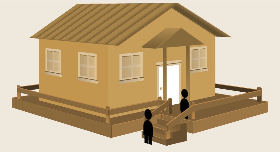
Yes, even for 3D. In this post, we will create a 3D animated wooden-house model with CSS.
Take a look at the DEMO here.
As a result, we will get a scene that is tilted at a 45-degree and viewed at a 2000-pixels viewpoint using the
perspectiveThe objects positioned in this model are normal HTML elements. They have widths, heights, and are rectangular. This means that as you build a 3D object, you place each rectangle in place. The HTML elements are placed within the 3D scene using the
transformbordergradientCSS Transform
The
transformtranslate3dAlso, note that
translate3dtransformrotateskewscalematricsIn particular, this is the scene that will be created: The first is its static view while the other is its animated view.
A quick note
This project has been developed and tested primarily in Chrome and so, supports all properties used. Hence, I’ve removed the prefixed versions of rules in the following CSS. I would recommend either using compilers like LESS or SASS to manage these for you. Otherwise, be aware that most browser prefixes will need to be applied. Full versions of the CSS and SASS can be found on this pen, including the HTML.
Let’s get started!
We need to set a scene in which we can build our 3D creation. To do this, we’ll need to use an HTML element as the parent element and give it the needed properties that tell the browser to expect 3D content within it. Let’s start with some HTML:
<article class="scene">...</article>In this case, the scene container is an
articlearticlearticleThe first property to apply is perspective. This property takes a value in pixels and represents the depth of the 3D scene. The
perspectiveFor this view to feel like a wide scenery and with our model structure seated fully, we will set the perspective value quite high at 2,000 pixels. We could also establish the scene viewing angle by adjusting the
perspective-originperspective-origin50% 50%article.scene {
transform: translate(0, 50px);
perspective: 2000px;
}Let’s Build!
With the scene set, we can start putting together our 3D masterpiece. When beginning to build 3D objects with HTML and CSS, it’s worth taking a moment to understand how these properties work. Before we start building, we will create a house section inside our article tag, which will contain the different features of our house model as a set of
div<section class="house">
<div class="deck"></div>
<div class="walls"></div>
<div class="roof"></div>
<div class="staircase"></div>
<div class="wedges"></div>
<div class="person"></div>
</section>The elements in the section above will take the form of the deck, the wall-frames and ceiling, the staircase attached at the top-left of the deck, the veranda and the animated persons.
With that in mind, we adjust our house class by rotating the entire scene by 45-degrees. We will have to set that now so as not to give us any issue with positioning our
divstransformtransform-styledivs.house {
margin: 0 auto;
position: relative;
transform-style: preserve-3d;
transform: rotateY(-45deg);
width: 460px;
}
.house div {
position: absolute;
transform-style: preserve-3d;
}Each
divpreserve-3dperspectiveWith this done, we can create our children elements inside our parent
divremremCreating the deck
The key concept of CSS drawing is to creatively use
border-radiusLet’s continue then, shall we?
<div class="deck">
  <div class="covering"></div>
  <div class="left"></div>
  <div class="right"></div>
  <div class="back"></div>
  <div class="front"></div>
</div>
.deck *:not(.covering),
.deck *::before,
.deck *::after {
border-right: 3px solid #78552c;
border-top: 2px solid #b5854a;
}
.deck .left {
width: 33.75rem;
height: 2.06rem;
background: #8a693d;
transform: translate3D(7.4rem, 19.6rem, 38.3rem);
}
.deck .right {
width: 61.3rem;
height: 2.9rem;
background: #4e3b23;
transform: translate3D(-38.4rem, 29.1rem, -38.4rem);
}
.deck .back {
width: 53rem;
height: 2.9rem;
background: #4e3b23;
transform: translate3D(-66rem, 29.3rem, -12.8rem) rotateY(90deg);
}
.deck .front {
width: 25.3rem;
height: 2.2rem;
background: #9c7645;
transform: translate3d(32.1rem, 21.2rem, 9rem) rotateY(90deg);
}
The above rules assign a border-right and left to all sides of the deck except the covering to create a nice depth effect. It also describes a
widthheightbackground colordivNext, we create the other sides of the deck. Since it has four corners, I created two more sides — right and back sides and applied similar properties. You may have noticed I used a
rotateY.deck .back.deck .front.deck .right.deck .leftdiv::before, ::afterTo complete the deck, we will be creating a covering for it. We will create a large L-shape from a rectangular shape. This is to create room for the stairs which we will be building later. I could have made this shape using the clip-path property but I wanted the shapes used for this project to be built solely with backgrounds and sizes. And again, not all browsers support the clip-path property yet. With this, I use the stacking linear-gradient background below to achieve the L-shape for the covering.
background: linear-gradient(#7a5d37, #7a5d37) calc(100% — 124px) no-repeat, linear-gradient(#7a5d37, #7a5d37) 0 188px/100% no-repeat;We will also give it a
translate3drotateThe result of all this should be a scene that looks like this:
Erecting the wall frames
The HTML structure for the walls will be a little intricate, but we can always manage it, right? We will be inserting a window div inside the walls
divdivdivsdivFirst, each of the walls will be given a value of
12.5remtranslate3dwidthTo complete this wall, we will give it a brown color; a little darker than the front wall. They are the only two walls that will be exposed to the viewer and we want to make it appear that the light reflects more on the front wall than the left wall.
Next, we will create the right wall by giving it similar properties. For the
transformtranslate3d(-17.7rem, 6.25rem, -9.06rem)rotateYTo finish up this section, we will create the back and front walls in the same fashion but give them a
rotateY<div class="front">
<div class="windows">
<div class="rim first-rim">
<div class="louvres"></div>
<div class="bar"></div>
</div>
<div class="rim second-front-rim">
<div class="louvres"></div>
<div class="bar"></div>
</div>
</div>
<div class="doors">
<div class="door-open"></div>
<div class="door-close">
<div class="door-knob"></div>
<div class="door-bars"></div>
</div>
</div>
</div>.right, .left, .back, .front {
height: 12.5rem;
}
.walls .left {
width: 22rem;
background: #c3964f;
transform: translate3d(18.4rem, 6.2rem, 38.3rem);
}
.walls .right {
width: 22.2rem;
background: #8c682f;
transform: translate3d(18.1rem, 6.2rem, 9.4rem);
}
.walls .back {
width: 29.2rem;
background: #9f7636;
transform: translate3d(2.2rem, 6.3rem, 22.7rem) rotateY(90deg);
}
.walls .front {
width: 28.75rem;
background: #c79d5a;
transform: translate3d(26rem, 6.2rem, 23.9rem) rotateY(90deg);
}
At the end, we will have a nice-looking shape as the one below.
The windows and door
The windows will be created by giving the rim
div9px solid #dac29adiv7px solid #dac29aperspectivedivAfterward, we will be adding an extra class-names to the rims
divleftleft40px215px330pxNext, we create a
::before::afterdiv::before45%::afterdivbackgroundborder-topopacity.windows .rim {
top: 30px;
width: 4.3rem;
height: 3.75rem;
border-left: 9px solid #dac29a;
border-right: 9px solid #dac29a;
border-top: 7px solid #dac29a;
border-bottom: 7px solid #dac29a;
}
.windows .rim::before {
background: linear-gradient(to left, #dac29a, #bda886);
left: 45%;
width: 0.62rem;
height: 3.75rem;
content: '';
position: absolute;
}
.windows .rim::after {
background: linear-gradient(to left, #dac29a, #bda886);
top: 45%;
width: 4.3rem;
height: 0.45rem;
content: '';
position: absolute;
}
.windows .first-rim {
left: 40px;
}
.windows .second-left-rim,
.windows .second-right-rim {
left: 215px;
}
.windows .second-front-rim,
.windows .second-back-rim {
left: 330px;
}
.windows .louvres {
background: linear-gradient(to left, #dac29a, #b5a181);
border-top: 2px solid #7a5d37;
width: 4.3rem;
height: 3.75rem;
z-index: -1;
opacity: 0.7;
}
.windows .bar {
background: linear-gradient(to left, #dac29a, #b5a181);
border-top: 2px solid #7a5d37;
width: 6rem;
height: 0.5rem;
bottom: -15px;
right: -15px;
border-radius: 20px;
}
.doors .door-open {
width: 5.5rem;
height: 7.5rem;
bottom: 0%;
left: 40%;
border-right: 3px solid #a58152;
background: linear-gradient(12deg, #7a5d37 40%, #a07c43 0 70%);
}
.doors .door-close {
width: 5.5rem;
height: 7.5rem;
bottom: 0%;
left: 40%;
border-left: 8px solid #dac29a;
border-right: 8px solid #dac29a;
border-top: 8px solid #dac29a;
background: #fff;
}
.doors .door-knob {
width: 0.5rem;
height: 0.5rem;
background: linear-gradient(to top, #dac29a, #dac29a);
border-radius: 50%;
top: 50%;
left: 5px;
border-left: 2px solid #a28658;
}
.doors .door-bars {
width: 7rem;
height: 0.5rem;
background: linear-gradient(to top, #dac29a, #dac29a);
border-radius: 20px;
top: -15px;
left: -12px;
border-bottom: 2px solid #7a5d37;
}Styling the door requires two features. The first door-open
divlinear-gradientdivbackground-colorbackgroundborder-radiusRoofing the house structure
<div class="roof">
  <div class="left"></div>
  <div class="right"></div>
  <div class="front"></div>
  <div class="back"></div>
</div>

<div class="porch">
  <div class="bottom"></div>
  <div class="left"></div>
  <div class="right"></div>
  <div class="front"></div>
  <div class="first_bar bar"></div>
  <div class="second_bar bar"></div>
</div>
We will start this section by creating the HTML structure. Creating the upper compartments may look pretty straight-forward but it seemed to me to be the toughest part of this project. This is because I had to make several tilting and positioning points to get the shape I needed. We will be starting this section by creating the HTML
divsThe styling for the front side of the roof will be achieved by using borders to create a triangular shape. This could be done by using the clip-path property too but I’m opting for borders instead. First, we will give the
border-left:220px solid transparentborder-right:246px solid transparentborder-bottom:110px solid #e7b565translate3d.roof .front {
border-left: 220px solid transparent;
border-right: 246px solid transparent;
border-bottom: 110px solid #c79d5a;
transform: translate3d(25.6rem, -0.6rem, 23.7rem) rotateY(90deg);
}
.roof .back {
border-left: 203px solid transparent;
border-right: 203px solid transparent;
border-bottom: 98px solid #9f7636;
transform: translate3d(15.85rem, -0.6rem, 31.7rem) rotateY(90deg);
}
.roof .left {
width: 24.25rem;
height: 8.4rem;
background-image: repeating-linear-gradient(to left, #795f35, #a68349, 10%, #a68349, #795f35 10%);
border-right: 5px solid #86693b;
border-bottom: 3px solid #927340;
transform: translate3d(29.5rem, -1.8rem, 42rem) rotateX(45deg) skewX(-35deg);
}
.roof .right {
width: 41.25rem;
height: 12.5rem;
background-image: repeating-linear-gradient(to left, #8e734b, #65502d, 10%, #65502d, #8e734b 10%);
border-right: 5px solid #b38f55;
border-bottom: 3px solid #927340;
transform: translate3d(-12.3rem, -3.1rem, -0.7rem) rotateX(131deg) skewX(-35deg);
}The right and left roofs will also be created in the same fashion but with a twist. We will add a
rotateX(45deg)rotateX(45deg + 90deg)rotateX(135deg)Next, we also add a
skewXbackground: repeating-linear-gradient(to left, #8e734b, #65502d, 10%, #7b561a, #655235 10%)Next, we will be creating a porch that will be placed directly above the front door. The bottom-porch will be styled first to enable proper alignments of other sides of the porch. A
widthheight2.6rem11remtranslate3drotateX(89deg)Subsequently, we will also create the left and right side of the porch similarly but completely tilting them and make them steeper. For the front side, we will be creating a triangular shape using borders just like we did for the front and back sides of the roof. We will also adjust the sides and positions until it laps perfectly unto the other sides of the porch.
To complete the porch, we will create two pillars that will hold the porch and stretch from the bottom of the porch to the flooring.
.porch *:not(.front) {
  background: linear-gradient(to top, #795f35, #b18c50);
  border-right: 3px solid #9a7944;
}

.porch .bottom {
  width: 2.6rem;
  height: 11rem;
  transform: translate3d(52rem, 0.4rem, 36rem) rotateX(90deg);
}

.porch .left {
    width: 3rem;
    height: 6rem;
    transform: translate3d(51.1rem, 1.6rem, 38rem) rotateX(63deg);
}

.porch .right {
    width: 3rem;
    height: 5.9rem;
    transform: translate3d(51.3rem, 1.6rem, 32.8rem) rotateX(-63deg);
}

.porch .front {
    border-left: 70px solid transparent;
    border-right: 70px solid transparent;
    border-bottom: 36px solid #866a3c;
    transform: translate3d(58rem, 2.7rem, 44.2rem) rotateY(90deg);
}

.porch [class*='bar'] {
    height: 155px;
    width: 10px;
    border-radius: 0 0 5px 3px;
    background: linear-gradient(to bottom, #795f35, #b18c50);
    border-right: 3px solid #9a7944;
}

.porch .first_bar {
    transform: translate3d(52rem, 6rem, 37rem);
}

.porch .second_bar {
    transform: translate3d(51.8rem, 6rem, 31.5rem);
}
Walking up the staircase
<div class="staircase">
  <div class="vertical-step"></div>
  <div class="horizontal-step"></div>
  <div class="back-cover vertical"></div>
  <div class="bottom-cover horizontal"></div>
  <div class="side-cover"></div>
</div>
Building the stairs was not as difficult as I thought it would. What I had to do was to create div class —
horizontal-stepsvertical-stepsFor the pseudo-elements, I did not have to use
transformtopbottomleftrightFirst, we will start with the vertical-step
divwidthheighttransformtransformAll we have to do is to use
topleftBelow are the CSS rules:
.staircase [class*='vertical'],
.staircase [class*='vertical']::before,
.staircase [class*='vertical']::after {
  background-color: #7a5d37;
  border-right: 3px solid #78552c;
  border-top: 2px solid #b5854a;
}

.staircase .vertical-step {
  width: 5.62rem;
  height: 0.93rem;
  transform: translate3D(46.8rem, 18.3rem, 33.3rem) rotateY(-4deg);
}

.staircase .vertical-step::before {
  width: 6.2rem;
  height: 0.93rem;
  content: '';
  position: absolute;
  top: 24px;
  left: -40px;
}

.staircase .vertical-step::after {
  width: 6.2rem;
  height: 0.93rem;
  content: '';
  position: absolute;
  top: 48px;
  left: -65px;
}

.staircase [class*='horizontal'],
.staircase [class*='horizontal']::before,
.staircase [class*='horizontal']::after {
  background-color: #8a683d;
  border-right: 4px solid #78552c;
}

.staircase .horizontal-step {
  width: 5rem;
  height: 1.3rem;
  width: 80px;
  height: 21px;
  transform: translate3D(47.8rem, 17.5rem, 33.3rem) rotateX(90deg) rotateY(2deg);
}

.staircase .horizontal-step::before {
  width: 5rem;
  height: 1.3rem;
  content: '';
  position: absolute;
  top: 63px;
  left: 35px;
}

.staircase .horizontal-step::after {
  width: 5rem;
  height: 1.3rem;
  content: '';
  position: absolute;
  top: 116px;
  left: 63px;
}

.staircase .vertical-back {
  width: 6.25rem;
  height: 3.13rem;
  content: '';
  position: absolute;
  transform: translate3D(40rem, 20.6rem, 25rem) rotateY(-5deg);
}

.staircase .horizontal-back {
  width: 6.25rem;
  height: 3.55rem;
  content: '';
  position: absolute;
  transform: translate3D(39.2rem, 22.2rem, 27rem) rotateX(82deg) rotateY(1deg) skewX(-25deg);
}

.staircase .side {
  width: 1.25rem;
  height: 2.56rem;
  background: #674e2e;
  transform: translate3D(56.5rem, 16.68rem, 38rem) rotateY(90deg);
}

.staircase .side::before {
  width: 1.63rem;
  height: 1.71rem;
  background: #674e2e;
  content: '';
  position: absolute;
  transform: translate3D(-1.6rem, 0.8rem, 0rem);
}

.staircase .side::after {
  width: 1.31rem;
  height: 0.85rem;
  background: #674e2e;
  content: '';
  position: absolute;
  transform: translate3D(-2.9rem, 1.6rem, 0rem);
}
Subsequently, we create the bottom and back coverings by copying the properties for the horizontal and vertical steps, enlarge their widths and heights and place them accordingly. And for the side covering, I used a
clip-pathSo, I created a
divFraming the veranda
The HTML structure for the veranda will be pretty lengthy but needful because we will be placing bars and adjoining planks at all sides of the deck.
<div class="veranda">
  <div class="wedges">
    <div class="wedge1 border-left"></div>
    <div class="wedge2 border-left"></div>
    <div class="wedge3 border-left"></div>
    <div class="wedge4 border-right"></div>
    <div class="wedge5 border-right"></div>
    <div class="wedge6 border-right"></div>
    <div class="wedge7 border-right"></div>
    <div class="wedge8 border-left"></div>
    <div class="wedge9 border-left"></div>
  </div>

  <div class="planks">
    <div class="plank1 border-right"></div>
    <div class="plank2 border-right"></div>
    <div class="plank3 border-left"></div>
    <div class="plank4 border-left"></div>
    <div class="plank5 border-left"></div>
    <div class="plank6 border-right"></div>
    <div class="plank7 border-left"></div>
    <div class="plank8 border-left"></div>
  </div>
</div>
Erecting the veranda was my favorite part of this project. The positionings were quite straight-forward. The wedges lie at every corner of the deck, so once I got a wedge’s position rightly, I can only adjust an axis or two to get the opposite wedge’s position. This also applies to the planks which will be used to join the wedges together.
We will start with the wedges, and first, we will be creating nine wedges which are the total numbers to be fitted at every corner including the edges of the staircase as well. We will assign a general styling of 6px
border-radius1px solid #b5854aThe reason for this is the following. We want every wedge attached to the stairs to have a rotation of 90-degrees while the others remain at 0-degree. The stair wedges will be used to build the stair-rails, and so they will need to be rotated to perfectly form this shape and then only
border-leftborder-rightA similar procedure will be done for the planks
divsborder-topborder-rightViewing the images below will give a better visualization.
After giving them general styling, we can then begin to work on the positioning. Once we place a wedge at the corner, we can use good judgment to decide how far the opposite one can be. We will perform similar actions to the plank
divsAnd just like how we created the deck, we will give the front and back planks a
rotateYrotateY(90deg) rotateZ.veranda [class*='wedge'] {
border-top-left-radius: 6px;
border-top-right-radius: 6px;
border-top: 1px solid #b5854a;
}
.veranda .wedges [class*='border-right'] {
border-right: 3px solid #8a683d;
}
.veranda .wedges [class*='border-left'] {
border-left: 3px solid #8a683d;
}
.veranda .wedge1 {
width: 0.6rem;
height: 2rem;
background: linear-gradient(to bottom, #7a5d37, #523e25);
transform: translate3D(57.8rem, 14rem, 46.3rem) rotateY(90deg);
}
.veranda .wedge2 {
width: 0.7rem;
height: 2.3rem;
background: linear-gradient(to bottom, #7a5d37, #523e25);
transform: translate3D(54rem, 13.3rem, 38rem) rotateY(90deg);
}
.veranda .wedge3 {
width: 0.8rem;
height: 2.6rem;
background: linear-gradient(to bottom, #8a683d, #b78549);
transform: translate3d(45.8rem, 15rem, 32rem) rotateY(90deg);
}
.veranda .wedge4 {
width: 1rem;
height: 2.8rem;
background: linear-gradient(to bottom, #8a683d, #b78549);
transform: translate3D(40rem, 16.5rem, 38.5rem);
}
.veranda .wedge5 {
width: 1.3rem;
height: 2.8rem;
background: linear-gradient(to bottom, #8a683d, #b78549);
transform: translate3D(10rem, 16.5rem, 38.5rem);
}
.veranda .wedge6 {
width: 1rem;
height: 2.8rem;
background: linear-gradient(to bottom, #7a5d37, #523e25);
transform: translate3D(10rem, 16.5rem, 5.5rem);
}
.veranda .wedge7 {
width: 1rem;
height: 3rem;
background: linear-gradient(to bottom, #7a5d37, #523e25);
transform: translate3D(48rem, 16.3rem, 5.5rem);
}
.veranda .wedge8 {
width: 0.7rem;
height: 2.3rem;
background: linear-gradient(to bottom, #8a683d, #b78549);
transform: translate3D(58.5rem, 13.3rem, 38rem) rotateY(90deg);
}
.veranda .wedge9 {
width: 0.6rem;
height: 1.7rem;
background: linear-gradient(to bottom, #8a683d, #b78549);
transform: translate3D(61.8rem, 14.4rem, 46.5rem) rotateY(90deg);
}
.veranda .planks [class*='border-right'] {
border-right: 2px solid #78552c;
border-top: 2px solid #b5854a;
}
.veranda .planks [class*='border-left'] {
border-left: 3px solid #78552c;
border-top: 2px solid #b5854a;
}
.veranda .plank1 {
width: 4.7rem;
height: 0.7rem;
background-color: #795b36;
transform: translate3D(55rem, 13.6rem, 43.7rem) rotateY(90deg) rotateZ(-19deg);
}
.veranda .plank2 {
width: 1.7rem;
height: 0.7rem;
background-color: #806139;
transform: translate3D(53.5rem, 13.5rem, 39.2rem) rotateZ(-3deg);
}
.veranda .plank3 {
width: 8.8rem;
height: 0.7rem;
background-color: #8a683d;
transform: translate3D(52rem, 12.7rem, 46.7rem) rotateY(90deg);
}
.veranda .plank4 {
width: 30rem;
height: 0.9rem;
background-color: #8a683d;
transform: translate3D(12.7rem, 16.5rem, 40rem);
}
.veranda .plank5 {
width: 34rem;
height: 1rem;
background-color: #46341f;
transform: translate3D(-11rem, 17.7rem, 18.7rem) rotateY(90deg);
}
.veranda .plank6 {
width: 38rem;
height: 0.9rem;
background-color: #46341f;
transform: translate3D(10rem, 17rem, 5rem);
}
.veranda .plank7 {
width: 17rem;
height: 0.8rem;
background-color: #8a683d;
transform: translate3D(52rem, 13.2rem, 31.7rem) rotateY(90deg);
}
.veranda .plank8 {
width: 4.5rem;
height: 0.7rem;
background-color: #8a683d;
transform: translate3D(63rem, 12.5rem, 47.7rem) rotateY(90deg) rotateZ(-19deg);
}Building our characters
With the structure in place, we need some persons to move in and out of the house to show it is habitable. In the initial draft of this project, creating the characters was not in the picture but afterward, when the idea popped up, I thought it was a good one. Creating the characters and their animations gave the house scene a livelier look.
To build the characters, we need both persons to walk into the house with their starting point at the foot of the stairs. The first person will be going in through the door and this is where the door-open
divBoth character shapes are made up of 2 main parts, the heads and bodies. The legs are added using pseudo-elements on the body. So, both characters take one styling.
<div class="person">
  <div class="person-one">
    <figure class="head"></figure>
    <figure class="body"></figure>
  </div>
  <div class="person-two">
    <figure class="head"></figure>
    <figure class="body"></figure>
  </div>
</div>
Each of the parts is absolutely positioned and
border-radius.person .person-one figure,
.person .person-two figure {
background-color: black;
display: block;
position: absolute;
}
.person .person-one .head,
.person .person-two .head {
border-radius: 22px;
width: 20px;
height: 20px;
left: 3px;
top: 0;
}
.person .person-one .body,
.person .person-two .body {
border-radius: 30px 30px 0 0;
height: 30px;
top: 21px;
width: 26px;
}
.person .person-one .body:before,
.person .person-one .body:after,
.person .person-two .body:before,
.person .person-two .body:after {
content: "";
position: absolute;
background-color: black;
width: 9px;
height: 15px;
top: 30px;
}
.person .person-one .body:before,
.person .person-two .body:before {
left: 3px;
}
.person .person-one .body:after,
.person .person-two .body:after {
left: 14px;
}With the character shape of person-one and person-two specified, we will position them at the starting position. The person-one at the foot of the staircase, and the person-two a little further away from person-one. And we will also want to make person-two appear just right after person-one is being animated or start climbing the stairs. To set this up, we will give a scale of 0 to person-two and delay its animation for 5.5 seconds.
.person .person-one {
  transform: translate3d(935px, 179px, 780px) rotateY(0deg);
  animation: move-person-one 20s 3s infinite;
}

.person .person-two {
  transform: translate3d(935px, 179px, 790px) rotateY(0deg) scale(0);
  animation: move-person-two 15s 5.5s infinite;
}
Keyframe animation
With the characters in place, the scene is ready for some animation.
If you view the demo you’ll see a few animations taking place. Rather than go through all the animations that set up the scene, I’ll focus on the animation of the character walking in and out of the house and also on the opening and closing of the door.
Timing and animating the HTML elements is achieved by using keyframes and then attaching the set of keyframes to an element using the animation property.
The first thing is to animate the first character, to have it walk up the stairs and into the front door, walk into the house and out and approach the stairs again. Here’s a set of keyframes that achieves this:
@keyframes move-person-one {
  0%, 10%, 90% {
    transform: translate3d(935px, 179px, 780px) rotateY(0deg);
  }
  20%, 85% {
    transform: translate3d(870px, 169px, 610px) rotateY(0deg);
  }
  30%, 80% {
    transform: translate3d(870px, 175px, 610px) rotateY(86deg);
  }
  40%, 45%, 70% {
    transform: translate3d(635px, 215px, 415px) rotateY(86deg);
  }
  55%, 50% {
    transform: translate3d(620px, 215px, 405px) rotateY(86deg);
  }
  91% {
    transform: translate3d(945px, 179px, 810px) rotateY(0deg);
  }
  100% {
    transform: translate3d(945px, 179px, 990px) rotateY(0deg);
  }
}
Keyframes are a series of steps, described using percentages. The percentage relates to the animation time, so that if an animation was to last 10 seconds, 10% would be the 1-second mark. 90% would be the 9-second mark.
Next, we animate the door that opens each time the first character goes inside the house and closes when it leaves the house. The timing of when the first character approaches the front door and the time the door opens and vice-versa should be properly calculated. First, we will establish the same duration time of 20 seconds for both the first character and the door.
Afterward, we delay the first-character for 3 seconds and the door for 8 seconds, so this corresponds to the interaction described above. Next, immediately the door animation starts, we will transform its z-axis to 20-degrees and rotate its y-axis at 20-degrees and move the degrees higher at 4 seconds into the animation.
This animates the door by opening it wide enough for the character to pass through and close it at about the 9th second. I repeated the same animation after the 10th second till the end of it.
.doors .door-close {
  animation: door-open 20s 8s infinite;
}

@keyframes door-open {
  0% {
     transform: translate3d(0px, 0px, 20px) rotateY(20deg);
  }
  8%, 50% {
     transform: translate3d(0px, 0px, 53px) rotateY(53deg);
  }
  35%, 70%, 100% {
     transform: translate3d(0px, 0px, 0px) rotateY(0deg);
  }
}
Having done that, let’s set up the corresponding
animation@keyframes move-person-two {
0%, 10%, 80% {
transform: translate3d(935px, 179px, 790px) rotateY(0deg) scale(1);
}
20%, 75% {
transform: translate3d(870px, 169px, 610px) rotateY(0deg);
}
30%, 70% {
transform: translate3d(860px, 169px, 380px) rotateY(0deg);
}
35%, 65% {
transform: translate3d(860px, 169px, 380px) rotateY(89deg);
}
40%, 60% {
transform: translate3d(795px, 169px, 380px) rotateY(89deg);
opacity: 1;
}
41%, 50% {
opacity: 0;
}
81% {
transform: translate3d(965px, 179px, 820px) rotateY(0deg);
opacity: 1;
}
82% {
transform: translate3d(995px, 189px, 855px) rotateY(89deg);
}
100% {
transform: translate3d(1200px, 179px, 860px) rotateY(89deg);
}
}In this way, the two animations are being applied. The first character taking five more seconds later than the first to go through the animated cycle.
With the following animations and keyframes in place, the final result will be this:
Demo and source code
If you haven’t already, check out the finished result in a modern browser or download the source from Github.