TL;DR —
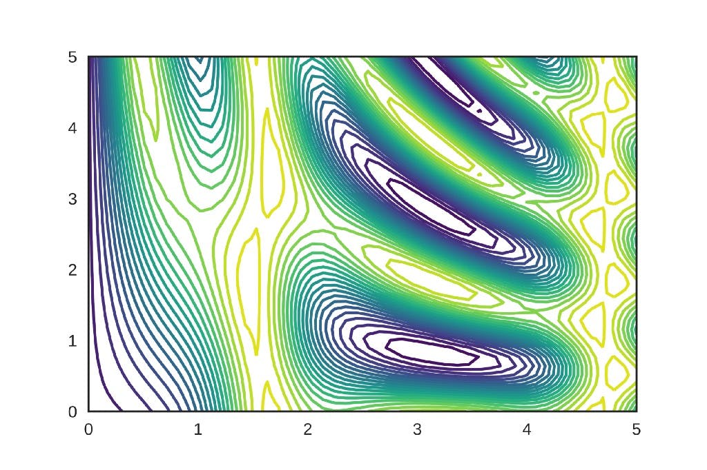
Contour map uses contours or color-coded regions helps us to visualize 3D data in two dimensions. Contour maps are also used to visualize the error surfaces in deep learning/machine learning optimization techniques like Gradient descent, Momentum gradient descent, Adam, etc… In this article, we will see how to interpret the contour maps and visualize the 3D Gradient ascent error surface using a contour map. The darker the shade of red indicates higher the loss value and darker the. shade of blue indicates lower the error value.
[story continues]
Written by
@NKumar
DeepLearning Enthusiast. Data Science Writer @marktechpost.com
Topics and
tags
tags
artificial-intelligence|deep-learning|machine-learning|gradient-descent|contour
This story on HackerNoon has a decentralized backup on Sia.
Transaction ID: Aldcwg5-j8Ib4hMEjLrZ0iS3Tl7J67qxwkfXxm56NNM