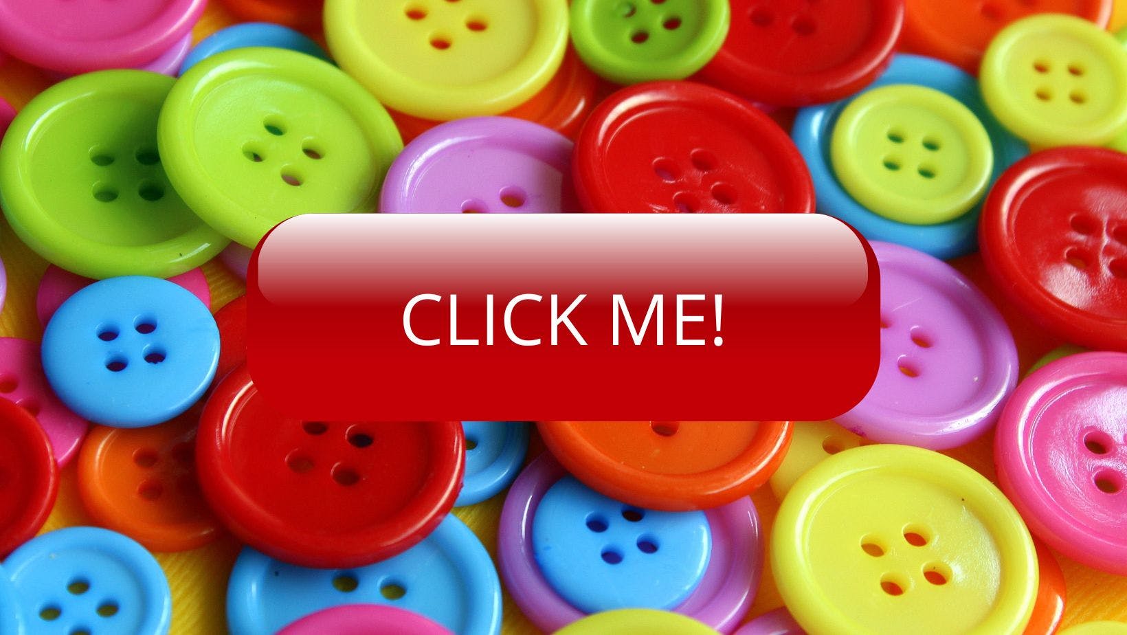
The first thing you’ll notice when you add a button to your website is that you’ve taken a trip back in time to 1999. The default button style is very old-fashioned and I can’t think of a use case where you’d want to keep it as it is. The good news is that there are loads of CSS styles that can make your buttons pop.
Remove Default
The first thing to do is remove the default buttons styles. It’s one of
those things that you might do 100 times, but you still need to
google every time. The CSS on how to remove the default style is
below.
those things that you might do 100 times, but you still need to
google every time. The CSS on how to remove the default style is
below.
button {
background: none;
color: inherit;
border: none;
padding: 0;
font: inherit;
cursor: pointer;
outline: inherit;
}
This will turn a button that looks like this
into one that looks like this
Color and Size
The next thing to do is to add your own styles. Bold colors with high
contrast text will help the button stand out. You will also probably
want to increase the button’s default size to make it more
prominent and add some padding. A call to action button might look like this.
contrast text will help the button stand out. You will also probably
want to increase the button’s default size to make it more
prominent and add some padding. A call to action button might look like this.
button {
  background: none;
  color: inherit;
  border: none;
  padding: 0;
  font: inherit;
  cursor: pointer;
  outline: inherit;
}
Fonts
Fonts can be another great way to make a button look more attractive. I've added the font Oswald from Google Fonts. I like a bold sans-serif font on a button but you should choose whatever you like. Follow the instruction on Google to add the font to your project then insert
font-family: "Oswald", sans-serif;Border-radius and Box-shadow
So far the button is standing out a lot more but to make it looks like
it seamlessly fits into the webpage it needs a couple more elements.
corners of the button. How much you want to do this is up to you. You
can just take the sharpness off the edges of the corners or turn it
into a full circle.
button a shadow, which will give it a cool floating appearance. You
can do a lot with
here
it seamlessly fits into the webpage it needs a couple more elements.
border-radiusbox-shadowcorners of the button. How much you want to do this is up to you. You
can just take the sharpness off the edges of the corners or turn it
into a full circle.
box-shadowbutton a shadow, which will give it a cool floating appearance. You
can do a lot with
box-shadowhere
Button {
  background: red;
  color: white;
  border: none;
  padding: 20px;
  font: inherit;
  font-size: 1.6rem;
  cursor: pointer;
  outline: inherit;
  border-radius: 15px;
  box-shadow: 5px 5px 5px #000;
}
Hover and Active
Now our button is looking pretty good, it’s time to add some
functionality. You can add all sorts of styles with
the button is hovered over and
clicked. Some of the things you might want to do are:
functionality. You can add all sorts of styles with
:hoverthe button is hovered over and
:activeclicked. Some of the things you might want to do are:
- change the box shadow
- change shape
- change color
For our button well change the brightness and box-shadow on hover and add indentation when it's clicked with
::activebutton:hover {
filter: brightness(120%);
box-shadow: 10px 10px 10px #000;
}
button:active {
box-shadow: inset 2px 2px 10px #000;
}
For some awesome examples of what can be done by manipulating
:hover:active::After
What other fun things can be done with buttons? You can combine
CSS animation to create an underline when the button is hovered.
::before ::after:hover:active::after:hoverCSS animation to create an underline when the button is hovered.
button::after {
  content: "";
  display: block;
  height: 5px;
  width: 0;
  background-color: #fff;
  transition: 0.1s width linear;
  margin: 0 auto;
}

button:hover::after {
  width: 100%;
}
Now it might be overkill having all of these effects but it shows you
what can be achieved.
what can be achieved.
Accessibility
There are a couple of important accessibility requirements to bear in mind.
Please please please use a
that looks and works like a button using
but it doesn’t have the same semantic meaning as a button. This
means that screen readers won’t know that it is a button.
<button>that looks and works like a button using
<div><a>but it doesn’t have the same semantic meaning as a button. This
means that screen readers won’t know that it is a button.
A button should look like a button. This is not just good for
accessibility but for anyone trying to navigate your site. With all
the styles you can add it’s important to remember that it should still be obvious that the element is a button. It should look
“clickable”. If it’s ambiguous it will cause confusion which is
not great for accessibility or UX. Adding some `box-shadow` to the
button often creates this effect.
Make the button easily visible. Much like you want good contrast between
text and the background, you also want to give your buttons lots of
contrast. It’s also important to show the status of a button. If a
button is going to remain depressed after clicking, to show that it is
active, consider adding a border or underline so that it can’t be
missed. This is important if the button shows the status of something
rather than if it’s just to submit a form, for example. Compare: