A while ago I decided as a hobby project to improve the User Experience of PSprices.com. I love their price monitoring website, but the UX is quite a mess. I tried to keep the design and branding unchanged, and only focused on improving the UX.
Normally I would never make changes to a website withouth analysing the existing usage data. In this case I had to make some assumptions, since I’m not involved with the website.
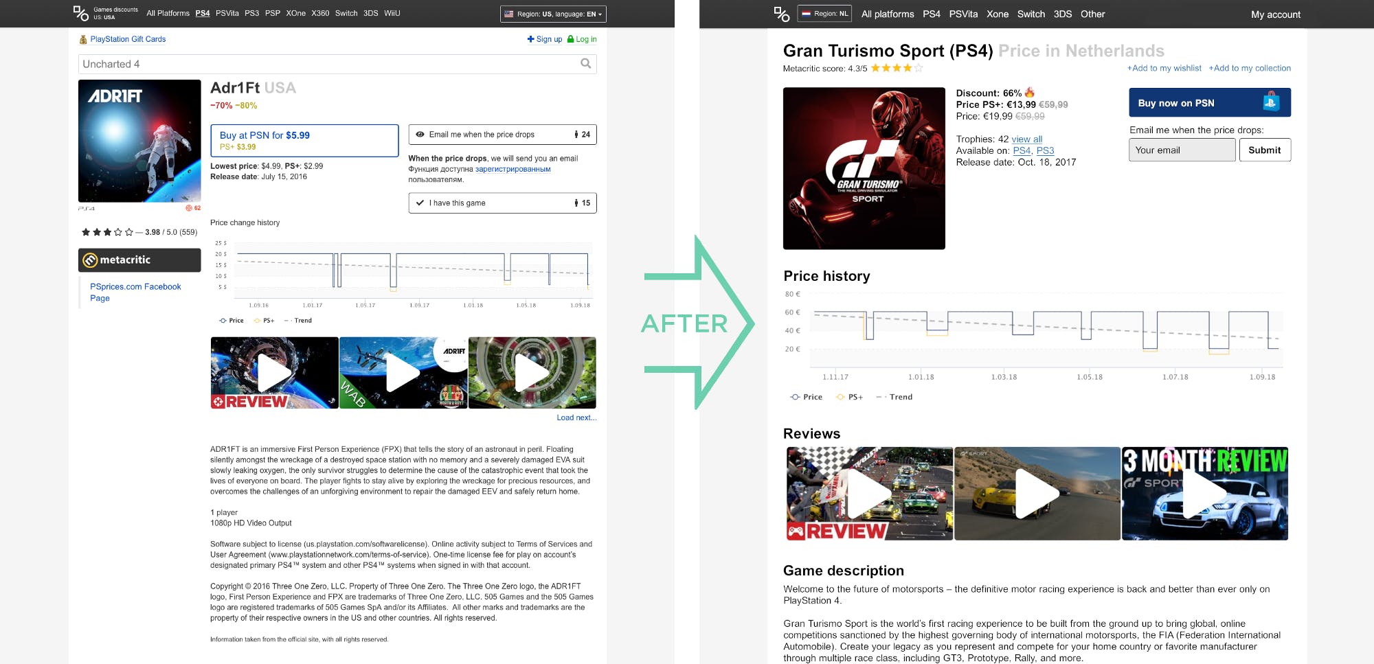
Before and after
My main focus was to help the users reach their goal: Buying the game now when the price is low, or buying it later when the price drops more. By reducing unnecessary info and improving the flow through the page I created a UX design that is very likely to perform better in reaching the user’s goals (and the business goals of the website). In the next sections I’ll go into the details and reasoning behind each of the UX and conversion improvements.
Improving the flow & focusing on the most common use-case
- First thing a user must do to get the correct price is selecting his country. Following the Gutenberg rule, I moved this button to the top left corner, catching the attention before reading the rest of the content. As a user myself I often experienced looking at the wrong price data, because the default country setting wasn’t mine.
- The second action a user must take to get correct info, is to select the platform of the game. Here I created more focus by removing older generation consoles and placing them under ‘Other’. My assumption is that less than 5% of the users is still buying games for those old platforms and they form unnecessary distractions.
- The price information used to be scattered all over the page. Now everything comes together in one area, with one font size, making scanning of the core info much easier. I used icons to further guide the user attention to the important info. I also made the call to prioritize PS+ prices above normal prices, assuming that 75% of the Playstation users visiting this website have a PS+ account that gives them access to these lower prices. Making the website focused on the most common use-case will reduce friction for the biggest group of users.
- The search bar was removed, on this results detail page. Instead it will be more prominent on the page before reaching this one. To have search quickly accessible on every page I would still consider adding it as a smaller field in the top menu bar.
Improving conversion with proven best practices
- Reduced the multitude of buttons to focus on one primary Call To Action button that grabs the user’s attention. Making the ‘buy now’ button solid and giving it a high contrasting color, improves the conversion.
- The secondary Call To Action button allows user to signup for price notifications. By allowing users to directly input their email and press submit, an additional step is removed to increase the usage of this feature.
- Removed unnecessary features that were distracting from the main user goals. The ‘nr of other people watching this price’, and ‘people that own this game’ do not directly contribute to the main goals. Although AB-testing in the future could be used to see if activity numbers from other users on the platform can increase the trust and as a result conversion.
- Changed the ‘login‘;’ and ‘signup’ copywriting to ‘my account’ and ‘add to my whishlist’ to communicate better the benefits of creating an account.
- Improved SEO by adding the platform name and word ‘price’ to the H1 title of the page. Making these longtail game detail pages better findable on common search queries. For example: ‘Grand turismo ps4 price’.
In the end UX is all about making clear decisions. Understanding user’s goals, keeping things simple and structured, and following best practises can help to increase conversion a lot.