What You'll Learn in This Guide
By the end of this article, you'll master:
- What Shadow DOM is and why it's a game-changer for web development
- How to implement Shadow DOM to isolate third-party HTML content
- Real-world techniques for embedding HTML templates without CSS conflicts
- Advanced patterns for mobile simulation and responsive previews
- Best practices for maintaining control over embedded content
Why This Matters to You (And Your Sanity)
Picture this: You've a beautiful email template builder. Users create stunning templates, and now you need to display these templates on your main platform for preview. Simple, right?
Wrong.
The moment you inject that HTML into your DOM, chaos ensues:
- Your carefully crafted platform styles get overridden
- The template's CSS bleeds into your UI components
- Buttons break, layouts shift, and your design system crumbles
- Users report bugs that seem impossible to reproduce
Sound familiar? You're not alone. This is the #1 pain point for developers building platforms that handle user-generated or third-party HTML content.
Why Most Developers Fail at HTML Isolation
The iframe trap: Most developers reach for iframes as their first solution. Sure, iframes provide perfect isolation, but they come with deal-breaking limitations:
- No programmatic control over the content
- Complex communication between parent and child
- Mobile responsiveness nightmares
- SEO and accessibility issues
The CSS namespace illusion: Others try to solve this with CSS namespacing, BEM methodologies, or CSS-in-JS solutions. These approaches are like putting a band-aid on a broken dam; they might work for simple cases, but they inevitably fail when dealing with complex, dynamic content.
The sanitisation maze: Some developers go down the rabbit hole of HTML sanitisation and CSS parsing. While important for security, this approach is fragile, performance-heavy, and often breaks legitimate styling.
Shadow DOM Is the Future of Content Isolation
Here's the truth: Shadow DOM is the web standard specifically designed to solve this exact problem. It's not just a hack or workaround; it's a fundamental browser feature that creates true style and DOM isolation.
Unlike other solutions, Shadow DOM gives you:
- True encapsulation: Styles cannot leak in or out
- Full programmatic control: Access and manipulate content as needed
- Native browser support: No external dependencies or performance overhead
- Flexible architecture: Works with any framework or vanilla JavaScript
Key Takeaways
• Shadow DOM creates isolated DOM trees that prevent CSS conflicts between your platform and embedded content
• Unlike iframes, Shadow DOM allows full programmatic control while maintaining perfect style isolation
• Mobile simulation becomes trivial when you control the viewport dimensions within the shadow root
• Performance is superior to iframe solutions since everything runs in the same document context
• Browser support is excellent, and Shadow DOM is supported in all modern browsers
• Security boundaries are maintained while allowing controlled interaction between the host and embedded content
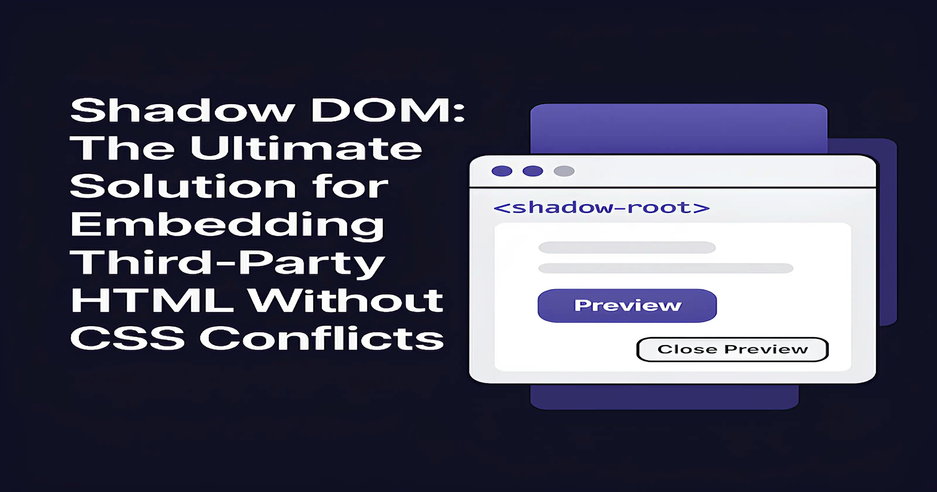
Real-World Use Case: Email Template Preview Platform
Let me walk you through a real scenario I encountered while building an email template builder platform.
The Challenge
We have built an email template builder where users can create complex HTML templates with custom CSS. The challenge was displaying these templates on our main platform for preview without:
- Breaking our existing UI components
- Having template styles leak into our design system
- Losing the ability to programmatically control the preview (ruling out iframes)
- Creating mobile-responsive preview modes
The Shadow DOM Solution
Here's an example of implementing a robust solution using Shadow DOM:Sure, it can be refactored even further; this is just to give an idea.
import { useRef, useEffect, useCallback } from 'react';

interface UseShadowDOMPreviewReturn {
  containerRef: React.RefObject<HTMLDivElement>;
  showPreview: () => void;
  hidePreview: () => void;
}

export const useShadowDOMPreview = (
  htmlContent: string,
  isMobile: boolean = false
): UseShadowDOMPreviewReturn => {
  const containerRef = useRef<HTMLDivElement>(null);
  const shadowRootRef = useRef<ShadowRoot | null>(null);

  useEffect(() => {
    if (containerRef.current && !shadowRootRef.current) {
      // Create isolated Shadow DOM
      shadowRootRef.current = containerRef.current.attachShadow({ mode: 'open' });

      // Define viewport dimensions
      const mobileWidth = 375;
      const mobileHeight = 667;

      // Create isolated styles
      const styleElement = document.createElement('style');
      styleElement.textContent = `
        :host {
          all: initial;
          display: none;
          position: fixed;
          top: 0;
          left: 0;
          z-index: 9999;
          background: white;
          ${isMobile ? `
            width: ${mobileWidth}px;
            height: ${mobileHeight}px;
            left: 50%;
            top: 50%;
            transform: translate(-50%, -50%);
            border: 2px solid #ccc;
            border-radius: 20px;
            overflow: hidden;
            box-shadow: 0 10px 30px rgba(0,0,0,0.3);
          ` : `
            width: 100%;
            height: 100%;
          `}
        }

        ${isMobile ? `
          /* Mobile simulation styles */
          * {
            -webkit-text-size-adjust: 100%;
            -webkit-tap-highlight-color: transparent;
          }

          html, body {
            width: ${mobileWidth}px !important;
            height: ${mobileHeight}px !important;
            margin: 0 !important;
            padding: 0 !important;
            overflow-x: hidden !important;
            font-size: 16px !important;
          }

          button, a, input {
            min-height: 44px !important;
            min-width: 44px !important;
          }
        ` : ''}
      `;

      shadowRootRef.current.appendChild(styleElement);
    }
  }, [isMobile]);

  useEffect(() => {
    if (shadowRootRef.current && htmlContent) {
      // Clear previous content while preserving styles
      const styleElement = shadowRootRef.current.querySelector('style');
      shadowRootRef.current.innerHTML = '';

      if (styleElement) {
        shadowRootRef.current.appendChild(styleElement);
      }

      // Process HTML for mobile if needed
      let processedHtml = htmlContent;
      if (isMobile) {
        processedHtml = `
          <div class="mobile-container" style="
            width: 100%;
            height: 100%;
            overflow: auto;
            -webkit-overflow-scrolling: touch;
          ">
            ${htmlContent}
          </div>
        `;
      }

      // Inject isolated content
      const contentDiv = document.createElement('div');
      contentDiv.innerHTML = processedHtml;
      shadowRootRef.current.appendChild(contentDiv);

      // Add mobile environment simulation
      if (isMobile) {
        const script = document.createElement('script');
        script.textContent = `
          // Override window dimensions for mobile simulation
          Object.defineProperty(window, 'innerWidth', { value: 375 });
          Object.defineProperty(window, 'innerHeight', { value: 667 });
          Object.defineProperty(navigator, 'userAgent', {
            value: 'Mozilla/5.0 (iPhone; CPU iPhone OS 14_7_1 like Mac OS X) AppleWebKit/605.1.15'
          });
        `;
        shadowRootRef.current.appendChild(script);
      }
    }
  }, [htmlContent, isMobile]);

  const showPreview = useCallback(() => {
    if (containerRef.current) {
      containerRef.current.style.display = 'block';
    }
  }, []);

  const hidePreview = useCallback(() => {
    if (containerRef.current) {
      containerRef.current.style.display = 'none';
    }
  }, []);

  return { containerRef, showPreview, hidePreview };
};
Implementation in React Component
const EmailTemplatePreview = ({ template, isMobile }) => {
  const { containerRef, showPreview, hidePreview } = useShadowDOMPreview(
    template.htmlContent,
    isMobile
  );

  return (
    <>
      {/* Isolated preview container */}
      <div
        ref={containerRef}
        className="email-preview"
        style={{ display: 'none' }}
      />

      {/* Platform UI remains unaffected */}
      <div className="preview-controls">
        <Button onClick={showPreview}>
          Preview {isMobile ? 'Mobile' : 'Desktop'}
        </Button>
        <Button onClick={hidePreview} variant="outline">
          Close Preview
        </Button>
      </div>
    </>
  );
};
The Results: Why This Approach Wins
Perfect Style Isolation
No more CSS conflicts. Our platform styles remained pristine while email templates displayed exactly as intended. The Shadow DOM boundary acted as an impenetrable wall between the two style contexts.
Mobile Simulation Made Simple
By controlling the viewport dimensions within the Shadow DOM, we created pixel-perfect mobile previews without the complexity of device detection or responsive breakpoints.
Maintained Control
Unlike iframe solutions, we could:
- Programmatically show/hide previews
- Access and modify content when needed
- Handle user interactions seamlessly
- Implement custom loading states and error handling
Superior Performance
Everything ran in the same document context, eliminating the overhead of iframe communication and cross-frame data transfer.
Advanced Patterns and Best Practices
1. Device-Specific Simulation
const DEVICE_PRESETS = {
  'iphone-se': { width: 375, height: 667, userAgent: '...' },
  'iphone-12': { width: 390, height: 844, userAgent: '...' },
  'android': { width: 360, height: 640, userAgent: '...' }
};

// Use specific device configurations
const device = DEVICE_PRESETS['iphone-12'];
const { containerRef, showPreview } = useShadowDOMPreview(
  htmlContent,
  true,
  device
);
2. Event Handling Across Shadow Boundaries
useEffect(() => {
  if (shadowRootRef.current) {
    // Handle clicks within shadow DOM
    shadowRootRef.current.addEventListener('click', (e) => {
      const target = e.target as HTMLElement;
      if (target.classList.contains('close-button')) {
        hidePreview();
      }
    });
  }
}, [hidePreview]);
3. Dynamic Content Updates
const updatePreviewContent = useCallback((newContent: string) => {
  if (shadowRootRef.current) {
    const contentContainer = shadowRootRef.current.querySelector('.content');
    if (contentContainer) {
      contentContainer.innerHTML = newContent;
    }
  }
}, []);
Security Considerations
While Shadow DOM provides style isolation, remember:
- Sanitize HTML content before injection to prevent XSS attacks
- Use CSP headers to restrict script execution within shadow roots
- Validate user-generated content even within isolated contexts
import DOMPurify from 'dompurify';

const sanitizedHtml = DOMPurify.sanitize(userHtml, {
  ADD_TAGS: ['custom-element'],
  ADD_ATTR: ['custom-attr']
});
Browser Compatibility and Fallbacks
Shadow DOM enjoys excellent modern browser support:
- Chrome 53+
- Firefox 63+
- Safari 10+
- Edge 79+
For older browsers, consider:
const hasShadowDOMSupport = 'attachShadow' in Element.prototype;

if (!hasShadowDOMSupport) {
  // Fallback to iframe or alternative solution
  return <IframePreview content={htmlContent} />;
}
Conclusion: Shadow DOM is Your Secret Weapon
Shadow DOM isn't just another web API; it's a paradigm shift in how we think about content isolation and component architecture. For developers building platforms that handle third-party HTML, email builders, widget systems, or any application requiring style isolation, Shadow DOM is not optional; it's essential.
The next time you face the challenge of embedding HTML content without CSS conflicts, remember: you don't need complex workarounds or fragile hacks. You need Shadow DOM.
Ready to implement Shadow DOM in your project? Begin with the patterns presented in this article and gradually expand to more complex use cases. Your future self (and your users) will thank you for choosing the right tool for the job.
That’s it, folks! Hope it was a good read 🚀