Open any travel booking site today and you’ll see them in bold, urgent colors:
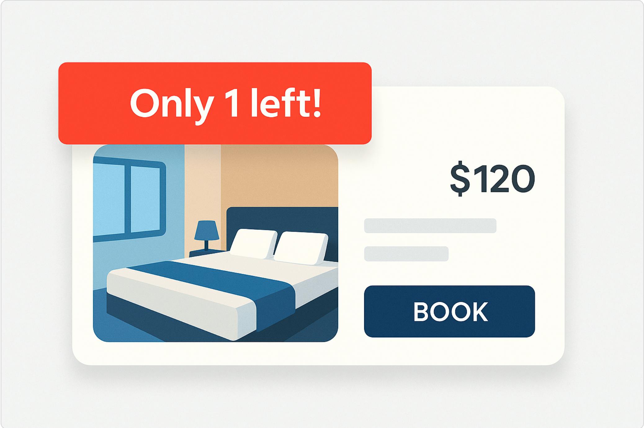
Only 1 room left at this price!
12 people are looking at this hotel right now.
These scarcity messages have become a universal playbook in travel and e-commerce. Booking flashes them in red banners. Amazon highlights “Only 2 left in stock.” Agoda tells you how often a listing is booked. The formula is everywhere, and it works — because it taps into some of the deepest shortcuts in human psychology.
But here’s the real question: how much do these nudges actually influence user behavior, and what happens if we overuse them?
As a product manager who has worked in big tech companies across different industries (Yandex, VK, Emerging Travel Group), I’ve seen firsthand how subtle interface changes can move the needle more than large algorithmic updates. In this article, I’ll share what we learned from running real scarcity experiments at our e-commerce product: what worked, what didn’t, why color and wording matter more than you’d expect, and how to strike the balance between boosting conversion and keeping user trust.
The Psychology Behind Scarcity
Scarcity works because it sits at the crossroads of cognitive biases and decision-making under uncertainty. A few well-documented effects are at play:
- Scarcity heuristic: we assume that if something is rare, it must be valuable (Cialdini, Influence).
- Loss aversion: losing a chance feels worse than the joy of gaining an alternative.
- FOMO (Fear of Missing Out): if others are booking it, I don’t want to miss my chance.
- Social proof: “X people are looking right now” transforms into invisible peer pressure.
Together, these biases create urgency even for rational users. A traveler who was “just browsing” suddenly feels they need to act now.
And yet, here’s the paradox: when asked in interviews, users often insist these messages don’t affect them. “I don’t even notice those little red labels,” they’ll tell you. But when you run experiments and track behavior, the metrics tell a very different story.
How did we use this knowledge in a real-world experience?
At Ostrovok, we decided to test scarcity messaging head-on. Instead of guessing, we ran a controlled experiment with three variants of urgency badges placed on hotel listings. The only things we changed were color and text:
- Orange badge — “This is a popular choice! Book now while it’s still available.”
- Red badge — “Hurry up, these apartments are about to be booked!”
- Green badge — “Rare find! These apartments are usually sold out.”
The results were striking:
- The orange badge completely flopped. It had no significant impact on conversion.
- The red badge outperformed everything else, driving a noticeable increase in bookings
- The green badge worked somewhat better than orange, but still trailed behind red
Why such a spread from what look like “minor” differences? It turns out, color and tone aren’t cosmetic details — they’re psychological triggers.
- Orange is an ambiguous signal. In many contexts, it communicates “warning” or “caution,” but not urgency. Think traffic cones or hazard vests. In UX, that often translates into hesitation, not action.
- Red is crystal clear: it screams “act now.” Research in color psychology shows red heightens arousal, urgency, and immediate action-taking. No surprise it dominates CTA buttons and warning labels worldwide.
- Green is the color of reassurance — safety, value, “green light.” It reinforced that the option was good, but it didn’t create the same time pressure as red.
And then there’s the text. The most effective badge combined a red background + a direct call to act immediately (“Hurry up…”). The weakest combined a vague orange with a soft suggestion.
In other words: urgency needs clarity. A half-hearted signal doesn’t just fail — it risks confusing the user.
What Users Say vs. What They Do
Here’s where things got even more fascinating.
Alongside the experiment, we ran user interviews. We asked travelers how they felt about these scarcity messages. The response was unanimous:
Oh, those? I ignore them. They don’t influence me at all.
Yet the data told the opposite story. The red badge variant alone produced a bigger uplift in conversion than some of our major search ranking improvements. A subtle design tweak outperformed weeks of backend work.
This gap between self-reported perception and actual behavior is well-known in UX research. Users sincerely believe they’re immune to these tricks — because no one wants to admit they’re being nudged. But behavior analytics consistently shows the opposite.
It’s a humbling reminder:
👉 Don’t take user statements at face value. Watch what they do, not just what they say.
For us, it reinforced the importance of running experiments, not relying solely on interviews. Interviews reveal attitudes; experiments reveal reality. And the reality was clear: scarcity worked, even when users denied it.
Ethical Balance: How Not to Lose User Trust
Once you see how well scarcity messages perform, it’s tempting to go all-in — to plaster red “Book now!” banners across every corner of the site, because, after all, they boost sales.
But in our product team, we consciously took a different path. From the start, it was essential for us to apply the scarcity mechanism ethically — honestly, transparently, and in the user’s best interest, not merely as a manipulation tactic.
We established several internal principles for how scarcity messages should (and shouldn’t) be used:
- Only when scarcity is real. The badge appears only when the shortage is genuine. If our data shows that a certain hotel or apartment consistently sells out quickly — for example, due to its great price-to-value ratio — then we highlight that fact to help the user. But if the property isn’t in high demand, we don’t fabricate urgency. Showing “Only 1 room left” when dozens are still available destroys trust.
- Guidance, not intimidation. The goal is to help users make decisions, not pressure them. When someone faces hundreds of hotel options, it’s easy to feel overwhelmed. In such cases, a subtle note like “Rare find, usually booked fast” acts as a helpful signal, drawing attention to a genuinely valuable option. It’s a win-win: the user books a great stay and has a positive experience, while we earn a satisfied customer who’s likely to return.
- Minimal intrusion. We intentionally kept urgency signals scarce. Overusing bright red banners can stress users out and harm the experience. Critics have often pointed out that overly aggressive urgency tactics — like on some booking platforms — increase anxiety and even post-purchase regret. Moreover, if users see these messages everywhere, they become numb to them. Fake or constant urgency quickly erodes credibility; audiences learn to tune it out. So we use scarcity messages sparingly, in moments when they truly matter — so they remain believable and effective.
In essence, we aimed to draw a clear line between ethical design and dark patterns. There are countless industry cases where a short-term conversion spike from deceptive urgency led to long-term reputational damage. We believe user trust is worth far more than a temporary sales bump. It’s better to sell a little less today and build a reputation for honesty than to squeeze the numbers now and lose loyal customers later.
In our experiment, we found the right balance: by showing real, data-backed urgency only where it genuinely helped users, we not only improved conversion but also increased the perceived value of the product. Users found what they were looking for — great hotels that matched their needs — and we gained their satisfaction and repeat bookings.
Conclusion
Scarcity and urgency are powerful levers of user behavior. The right color, the right words — they can nudge people to act faster, even when they swear they’re not influenced. But this lever must be used with precision and integrity.
A bright red “Last chance!” badge can drive clicks, but trust and loyalty are worth far more. The optimal approach is to emphasize genuine value and real demand — gently guiding users toward decisions that are truly good for them.
That balance pays off in the long run: happy users, stronger retention, and sustainable growth without reputational damage.
Our experience is proof of that.