
Modern user interfaces demand high interactivity and usability. This article explores how to create a powerful, adaptive multi-select component using the Vue 3 Composition API. The ChipsMultiSelect component combines the features of a dropdown list, visual selection in the form of "chips," and built-in filtering functionality.
Selected items are displayed as "chips".
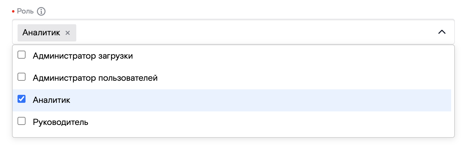
Real-time Filtering: The component integrates a dropdown list, a set of chips, and an input field for filtering.
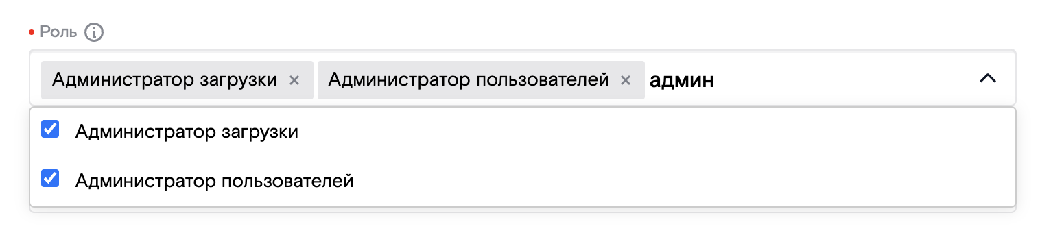
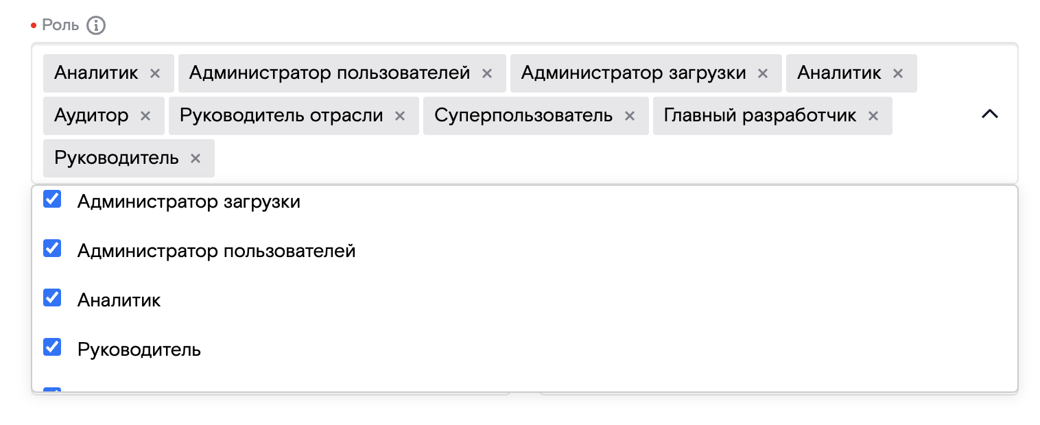
Dynamic Resizing: When there are too many chips, they wrap to a new row, adjusting the height of the input field accordingly.
Key Features of ChipsMultiSelect
- Interactive State Management:
- Selected items are displayed as chips.
- Chips can be removed using a "close" icon.
- Search and Filtering Support:
- The input field allows users to search for items in real-time.
- The list updates dynamically based on the user input.
- Responsive Design:
- The input field's height adjusts dynamically for multiple rows of chips.
- Chips wrap to new lines when the maximum width is exceeded.
- Easy Integration:
- Supports various data formats, including strings, objects, and arrays.
Implementation Details
Challenges:
Styling the input field to display chips while ensuring proper caret positioning after the chips was a significant challenge. Additionally, the input field needs to shift dynamically to align with the last row of chips when they span multiple lines.
Solution:
Using editable divs (contenteditable=true) instead of traditional input fields simplifies styling and implementation. This approach resolves positioning and styling issues efficiently.
Key Techniques:
- Use innerText to retrieve user input for filtering.
- Prevent new lines on Enter keypress using event.preventDefault().
Component Structure
- Chip Component (ChipsItem):
- Represents an individual chip.
- Supports both strings and objects.
- Includes a "close" button for removal.
- Designed for reuse across projects.
- Chip List (ChipsList):
- Displays a collection of selected chips.
- Handles user interactions.
- Main Component (ChipsMultiSelect):
-
Encapsulates ChipsList, dropdown list, and filtering functionality.
-
ChipsItem:
<script setup>

import Icon from '@/ui-library-b2b/icons/B2BBaseIcon.vue'

const props = defineProps({

  item: {

    type: Object,

  },

  bindName: {

    type: String,

    default: 'name',

  },

})

const emit = defineEmits(['delete'])

function deleteItem() {

  emit('delete', props.item)

}

</script>

<template>

  <div class="selected-item">

    {{ item[bindName] }}

    <div class="selected-item__close" @click.stop="deleteItem()">

      <Icon icon="Close" />

    </div>

  </div>

</template>

<style scoped lang="scss">

.selected-item {

  display: flex;

  gap: 4px;

  align-items: center;

  color: var(--text-colors);

  font-weight: 300;

  font-style: normal;

  line-height: 20px;

  white-space: nowrap;

  font-size: 14px;

  letter-spacing: 0.005em;

  text-align: left;

  flex-direction: row;

  padding: 4px 6px 4px 8px;

  background: rgba(16, 24, 40, 0.1);

  border-radius: 2px;

  &__close {

    color: black;

    cursor: pointer;

  }

}

</style>
ChipsList:
<script setup>

import { ref } from 'vue'

import SelectedItem from '@/ui-library-b2b/search/ChipsItem.vue'

const props = defineProps({

  bindName: {

    type: String,

    default: 'name',

  },

  inn: {

    type: Boolean,

    default: false,

  },

})

const emit = defineEmits(['on-keyup', 'blur'])

const chips = defineModel()

const multiselectRef = ref(null)

function deleteItem(item) {

  chips.value = chips.value.filter((el) => el !== item)

}

function onKeyUp(e) {

  emit('on-keyup', multiselectRef.value.textContent)

  if (e.key === 'Enter') {

    multiselectRef.value.textContent = ''

  }

}

function onBlur() {

  emit('blur', multiselectRef.value.textContent)

  multiselectRef.value.textContent = ''

}

function handleInput() {

  const maxLength = 12

  if (props.inn) {

    if (multiselectRef.value.textContent.length > maxLength) {

      multiselectRef.value.textContent = multiselectRef.value.textContent.slice(0, maxLength)

    }

    multiselectRef.value.textContent = multiselectRef.value.textContent.replace(/\D/g, '')

  }

}

</script>

<template>

  <div class="chips">

    <div v-for="(item, index) in chips" :key="index">

      <SelectedItem :item="item" :bind-name @delete="deleteItem" />

    </div>

    <div

      ref="multiselectRef"

      contenteditable="true"

      spellcheck="false"

      class="custom-div"

      @keydown.enter.prevent=""

      @keyup="onKeyUp"

      @blur="onBlur"

      @input="handleInput"

    />

  </div>

</template>

<style lang='scss' scoped>

.chips {

  display: flex;

  flex-direction: row;

  flex-wrap: wrap;

  gap: 3px;

  margin-top: 4px;

  width: 100%;

}

.custom-div {

  flex-grow: 1;

  white-space: nowrap;

  display: flex;

  align-items: center;

  overflow: hidden;

}

.custom-div:focus {

  outline: none;

}

</style>
Main component (ChipsMultiSelect)
<script setup lang="ts">

// import

import { ref } from 'vue'

import Chips from '@/ui-library-b2b/search/ChipsList.vue'

import Icon from '@/ui-library-b2b/icons/B2BBaseIcon.vue'

// props

const props = defineProps({

  caption: {

    type: String,

    default: 'Список холдингов',

  },

  placeholder: {

    type: String,

    default: '',

  },

})

// const

const searchText = defineModel()

const chips = ref([])

const title = ref('My title')

const titleElement = ref(null)

// methods

function validate(event: Event) {

  event.preventDefault()

  // (event.target as HTMLInputElement).blur()

  chips.value.push(titleElement.value.innerText.trim())

  titleElement.value.innerText = ''

}

function keyUp() {

  searchText.value = titleElement.value.innerText

  console.log(titleElement.value.innerText)

}

defineExpose({ titleElement })

</script>

<template>

  <div class="multi-search">

    <div class="multi-search__input">

      <Icon class="multi-search__icon-search" icon="Search" />

      <Chips v-model="chips" style="padding-left: 40px;" />

      <div

        ref="titleElement" contenteditable="true" spellcheck="false" :placeholder="chips.length > 0 ? '' : placeholder" @keyup="keyUp"

        @keydown.enter="validate"

      />

    </div>

  </div>

</template>

<style scoped lang="scss">

.multi-search{

  [contenteditable=true]:empty:before{

    content: attr(placeholder);

    padding-top: 3px;

    pointer-events: none;

    display: block;

    font-style: normal;

    font-weight: 400;

    font-size: 14px;

    line-height: 20px;

    letter-spacing: 0.005em;

    color: rgba(16, 24, 40, 0.5);

  }

  div[contenteditable=true] {

    padding: 5px;

    width: 100%;

    outline:none;

  }

  position: relative;

  &__icon-search{

    position: fixed;

    margin: 5px 10px;

    width: 24px;

    height: 24px;

  }

  &__input{

    display: flex;

    flex-direction: row;

    flex-wrap: nowrap;

    width: 800px;

    height: 36px;

    box-sizing: border-box;

    border: 1px solid rgba(16, 24, 40, 0.1);

    box-shadow: inset 0px 1px 0px rgba(16, 24, 40, 0.05), inset 0px 2px 0px rgba(16, 24, 40, 0.05);

    border-radius: 4px;

  }

  .btn {

    width: 16px;

    height: 16px;

    position: absolute;

    top: 8px;

    bottom: 10px;

    right: 10px;

    display: none;

    border: 0;

    padding-top: 0 -5px;

    border-radius: 50%;

    background-color: #fff;

    transition: background 200ms;

    outline: none;

    &:hover {

      width: 16px;

      height: 16px;

      display: block;

      background: url("../../assets/img/navigation/close.svg") no-repeat;

    }

  }

  input:valid ~ div {

    display: block;

  }

  .ok {

    background: url("../../assets/img/navigation/ok.svg") no-repeat;

  }

  .err {

    background: url("../../assets/img/navigation/close_gray.svg") no-repeat;

  }

}

</style>
Real-World Applications
- CRM Systems: Efficient filtering and selection from large directories.
- E-Commerce: Product filtering based on attributes.
- Tag Management: Category handling in CMS systems.
Conclusion
This article demonstrates how to create an interactive UI component that:
- Simplifies the integration of filters and search functionality in web applications.
- Enhances data input management and validation.
- Offers extensive customization options through props and events.
ChipsMultiSelect showcases the power of Vue 3 in building interactive UI components. Its flexibility and robust functionality make it a valuable tool for web developers, seamlessly integrating into projects to enhance user experience.
Source Code: https://github.com/lyashov/ChipsMultiSelect.git
[story continues]
tags