
Table of Links
-
Related Work
2.1 Semantic Typographic Logo Design
-
3.1 General Workflow and Challenges
-
Discussion
8.1 Personalized Design: Intent-aware Collaboration with AI
8.2 Incorporating Design Knowledge into Creativity Support Tools
3.2 Concerns in Generative Model Involvement
With the rise of generative models like Midjourney, many designers began to embrace AI for design assistance. The following are two main concerns about AI involvement in their design process.
- Lack of controllability of text-conditioned generative model. The most widely used method for controlling generative models is through textual prompts. Though various tools can assist in designing prompts, like PromptBase[1] and PromptHero[2], these tools emphasize imitating certain styles and lacking precise control of specific shape and layout. When dealing with highly personalized imagery, the time and effort invested in crafting a prompt experiences a significant surge. As E1 notes, “Each time I intricately design a prompt in anticipation of the generated result, it prompts me to open Illustrator again.”
- Lack of refinement and editability of generative result. Lack of editability in the results appears to be a common issue of generated models. While users may be generally satisfied with the overall outcome, there can be instances where certain details may not meet their expectations (e.g., dislike colors, redundant objects). One approach to address this is to regenerate the entire image, which results in losing the current design.
3.3 Design Space of Semantic Typography Work
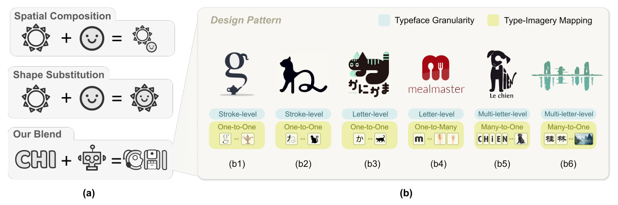
To further identify design patterns shaping semantic typographic logos, we collect and analyze a corpus of 427 real-world examples[3]. To ensure the diversity of sources, we include examples from prior research [23, 61], reputable design communities[4], and influential design shared on social media. The keywords we mainly use for search are “topographic logo,” “semantic topography,” and “word as image”. Focusing on logogram (Chinese (97), Japanese (34), Korea (30)) and alphabet language (English (229), French(20), Russian(17)), we filter search engine results for each language based on “popular” and “new” criteria, considering both widespread acknowledgment and timeliness. As Fig. 3 shows, our corpus analysis reveals two critical aspects of design patterns: (1) typeface granularity and (2) type-imagery mapping.
3.3.1 Typeface Granularity. While various languages have their own unique symbols, they conform to a shared structural granularity. This hierarchy, arranged from local to global, encompasses stroke, letter, and multi-letter, respectively*.*
• Stroke-level. It often employs stroke decomposition, where a single stroke or a group of strokes is associated with imagery (123/427 examples). As illustrated in Fig. 3 (b1), the spout of a teapot aligns with the original curve in the letter “g”, enhancing semantic expression while preserving typeface integrity. As the smallest unit of typeface, stroke-level blend can be implemented multiple times within a typeface to enrich visual representation.
• Letter-level. Individual letters are commonly used in our collected corpus (189/427 examples). Rather than conducting a letter-level blend to every single letter, certain examples tend to focus on partially representative letters within a word, particularly the first letter in Fig. 3 (b6). To emphasize the imagery, they employ techniques such as scaling, elongation, and rotation on the letters.
• Multi-letter-level. Blending imagery with multiple letters or entire words is the multi-letter-level blend (115/427 examples). It regards the typeface as a cohesive unit and spatially arranges the letter in a proper position. According to Fig. 3 (b5), the letters are rearranged and distorted to create the recognizable silhouette of a dog.
3.3.2 Type-Imagery Mapping. We observe a complex linkage between typeface and imagery. Prior works simplify such linkage by adopting a single mapping strategy, where one letter is associated with specific imagery. To approximate TypeDance to the design practice of semantic typographic logo, we manually encode the corpus and identify three typical mapping patterns: one-to-one, one-to-many, many-to-one. With a comprehensive understanding of how typeface interact with imagery, we can better instantiate the design principles to empower the creation process.
• One-to-One Mapping. One logo corresponds to one imagery commonly observed in the corpus (294/427 examples). It preserves typeface structures using partial strokes or letters to represent the same imagery. For instance, in Fig. 3 (b1), the letter “g” incorporates the imagery of a teapot spout. Additionally, we observed that logos with one-to-one mapping often employ repetitive imagery with a consistent style within a particular typeface.
• One-to-Many Mapping. The semantic typographic logo in this portion will distribute multiple imageries in the typeface involved in the design (14/427 examples). This mapping type supports rich imagery coverage within a compact space, where the semantic concepts usually share the same theme. Fig. 3 (b4) integrates both spoon and fork into a letter “m”, underscoring the theme of the meal.
• Many-to-One Mapping. Another aspect involves integrating multiple letters in typeface into a single imagery (119/427 examples), typically achieved by combining entire words to convey a complex visual representation of meaning, see Fig. 3 (b3, b4). This creative approach can be traced back to Giuseppe Arcimboldo, who skillfully merged various elements and shapes to create cohesive portraits and figures [32]. The many-to-one mapping enhances the overall unity and deepens the expression of semantic meaning.
3.3.3 Summary. Through corpus analysis, we uncover different typeface granularity and various type-imagery mapping. The combination of these design patterns presents an opportunity to convey rich visual representations. Both logograms and alphabet languages adhere to these patterns but exhibit distinct preferences. The complex typeface structure of logograms and their inherent pictorial origins result in more elaborate imagery combinations. For instance, compared to the French word in Fig. 3 (b5), the Chinese words in Fig.3 (b6) achieve a blending with traditional landscape paintings without spatially rearranging the typefaces.
Additionally, we note distinctions in real-world logo design compared to the formal definition of semantic typography. In real-world logo design, blending is not uniformly applied to all typefaces. Instead, emphasis is placed on letters in the initial position or those closely related semantically to the imagery (171/427 examples). Moreover, in significant designs, the typeface often has a less direct semantic relationship with the incorporated imagery (203/427 examples). This observation aligns with insights from an interview with E2, who remarked, “The selection of imagery depends on the brand’s story, and the logo’s meaning is for users to associate the imagery directly with the brand.”
4 DESIGN CONSIDERATION
The expert interview reveals that personalizing a semantic typographic logo relies on blending specific typefaces (e.g., at different granularity) and imagery (e.g., concrete visual representation), further identified through corpus analysis. Challenges in user workflow and concern about generative AI highlight using easily accessible images for effective personalization, eliminating the need for intricate text prompts that may not fully capture user intentions. Guided by Shneiderman’s design principle [46] of “Design with low thresholds, high ceilings, and wide walls,” our goal is to develop a tool that enables novices to create with accessible materials and interactions (D1), automates complex blend manipulation for professionals (D2), and integrates essential functionalities for a streamlined design process (D3). The roadmap we derive the design considerations is illustrated in Fig. 2. Below, we present the set of design considerations:
D1. Intent-aware design material and interaction. We aim to support flexible material selection, allowing the easy switch between typefaces at different granularities and the selection of imagery from specific visual representations in a user-customized image.
D2. Facilitate the professional generation process. We aim to propose an
D3. Provide necessary functionalities to support a comprehensive workflow. In the pre-generation stage, we will incorporate an ideation module for brainstorming. In the post-generation stage, an evaluation and iteration module will be added to identify, edit, and refine the generated result within the type-imagery spectrum.
Authors:
(1) SHISHI XIAO, The Hong Kong University of Science and Technology (Guangzhou), China;
(2) LIANGWEI WANG, The Hong Kong University of Science and Technology (Guangzhou), China;
(3) XIAOJUAN MA, The Hong Kong University of Science and Technology, China;
(4) WEI ZENG, The Hong Kong University of Science and Technology (Guangzhou), China.
This paper is
[3] The online page of a corpus of semantic typographic logo
[4] https://www.pinterest.com/
[story continues]
tags