For years, our data visualization toolbox in Python has been dominated by two giants: Matplotlib and Seaborn. They are the undisputed champions of static, publication-quality graphics. They allow us to create beautiful, precise "photographs" of our data. But in the modern world of web-based dashboards and dynamic reports, a photograph is often not enough. Static charts are a one-way conversation.
What if your charts could talk back? What if your users could hover over a data point to see its exact value, zoom into a specific time range, or filter data on the fly?
This is the paradigm of interactive visualization, and its leading practitioner in the Python ecosystem is Plotly. This article will guide you through this paradigm shift, showing you how to build your first web-native, interactive chart.
The Paradigm Shift: From Pixels to Data Objects
The magic of Plotly lies in a fundamental change in how a visualization is created and rendered.
- Matplotlib/Seaborn (The Photograph): These libraries issue a series of drawing commands to a backend. The final output is a static image file (like a PNG or SVG) made of pixels or vector paths. Once rendered, the link between a visual element (a bar on a chart) and the underlying data point is lost.
- Plotly (The Interactive Map): Plotly doesn't create a static image. It creates a rich, structured JSON object that contains everything: the data, the layout instructions, and the rules for interactivity. This JSON "blueprint" is then sent to a browser, where Plotly.js (a powerful JavaScript library) renders it. Because the browser has the full data object, it can handle interactions like hovering and zooming locally, without ever needing to ask the Python server for a new image.
You're not just creating a picture of the data; you're creating a small, self-contained data application.
Meet the Plotly APIs: Your Two Best Friends
Plotly offers two distinct but related APIs, each designed for a different stage of the analytical workflow. Understanding them is key to using the library effectively.
- Plotly Express (PX): The Prefabricated Home Kit This is the high-level, "batteries-included" API. It's designed for speed and convenience, perfect for exploratory data analysis (EDA). With a single function call, you can create a complex, fully interactive chart. PX makes intelligent assumptions about layout, legends, and styling, letting you focus on the data.
- Plotly Graph Objects (GO): The Custom Architectural Blueprint This is the low-level, foundational API. It gives you granular control over every single element of the plot. You build the figure from the ground up, defining each "trace" (the data layer) and every "layout" property (the styling layer). This is the API you need for complex, multi-layered charts, dual-axis plots, and production-ready dashboards where every detail matters.
The best part? Plotly Express is just a smart wrapper around Graph Objects. Every figure you create with PX is a GO figure under the hood, which means you can always start with the speed of PX and then use GO methods to fine-tune the details.
The Main Event: Building a Chart, Two Ways
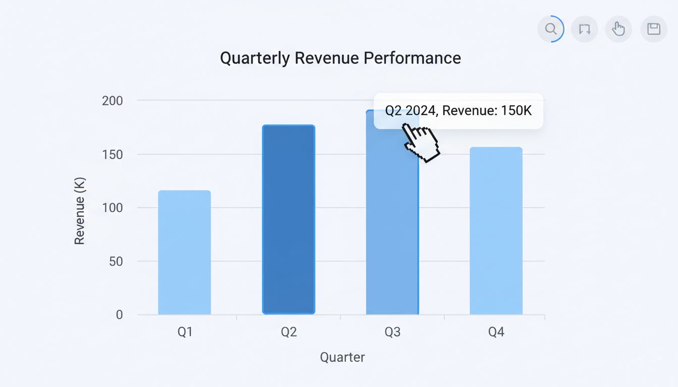
Let's build a simple, interactive bar chart showing quarterly revenue. We'll do it first with Plotly Express to see the speed, and then with Graph Objects to understand the architecture.
Here is the full, self-contained code. You can copy, paste, and run this in any Python environment.
import pandas as pd
import plotly.express as px
import plotly.graph_objects as go
from plotly.offline import plot
import os

# --- 1. Data Preparation ---
# A simple DataFrame is the ideal input for Plotly.
df = pd.DataFrame({
    'Quarter': ['Q1 2024', 'Q2 2024', 'Q3 2024', 'Q4 2024'],
    'Revenue': [100, 150, 130, 180]
})

print("--- Data Ready for Plotting ---")
print(df.head())
print("-" * 35)


# --- 2. The Plotly Express Way (Fast & Easy) ---
# One line of code generates the entire interactive figure.
fig_px = px.bar(
    df,
    x='Quarter',
    y='Revenue',
    title='Quarterly Revenue (via Plotly Express)',
    color='Quarter',  # Automatically adds color and a legend
    labels={'Revenue': 'Total Revenue ($K)'}, # Easy label renaming
    template='plotly_dark' # Apply a modern theme
)


# --- 3. The Graph Objects Way (Powerful & Explicit) ---
# Here, we build the figure piece by piece.

# Step A: Initialize an empty Figure object (the canvas)
fig_go = go.Figure()

# Step B: Define and add a 'trace' (the data layer)
fig_go.add_trace(
    go.Bar(
        x=df['Quarter'],
        y=df['Revenue'],
        name='Revenue Trace',
        marker_color=['#636EFA', '#EF553B', '#00CC96', '#AB63FA'] # Manually define colors
    )
)

# Step C: Define and update the 'layout' (the styling layer)
fig_go.update_layout(
    title_text='Quarterly Revenue (via Graph Objects)',
    xaxis_title='Fiscal Quarter',
    yaxis_title='Total Revenue ($K)',
    template='plotly_dark'
)


# --- 4. Output Generation ---
# This will save the GO figure as an interactive HTML file and open it in your browser.
# We use `plot()` from `plotly.offline` to ensure it works outside of a Jupyter Notebook.
output_filename = 'interactive_chart.html'
plot(fig_go, filename=output_filename, auto_open=True)

print(f"Interactive chart saved to: {os.path.abspath(output_filename)}")
print(f"Notice that both fig_px and fig_go are of the same base type: {type(fig_go)}")
Deep Dive: Deconstructing the Code
Let's break down exactly what's happening in each approach.
The Plotly Express Approach (The Magic of One Line)
fig_px = px.bar(
    df,
    x='Quarter',
    y='Revenue',
    title='Quarterly Revenue (via Plotly Express)',
    color='Quarter',
    labels={'Revenue': 'Total Revenue ($K)'},
    template='plotly_dark'
)
With a single call to px.bar, we gave it our DataFrame and told it which columns to map to which visual roles:
x='Quarter': Use the 'Quarter' column for the x-axis.y='Revenue': Use the 'Revenue' column for the y-axis.color='Quarter': This is a powerful feature. It tells PX to assign a unique color to each bar based on its 'Quarter' value and automatically create a legend.labels={...}: A simple dictionary to provide user-friendly names for the axes.template='plotly_dark': Applies a pre-packaged theme for a modern, dark-mode look.
That's it. PX builds the complete go.Figure object internally and returns it.
The Graph Objects Approach (The Power of Precision)
This approach is more verbose but exposes the core architecture of a Plotly figure.
Step A: fig_go = go.Figure() You start with a blank canvas. This Figure object is an empty container waiting for you to add data and styling.
Step B: fig_go.add_trace(go.Bar(...)) A trace is a single data series and its visual representation. Our figure has one trace: a bar chart.
- We explicitly create a
go.Barobject. - We must pass the full Pandas Series (
df['Quarter']) to thexandyparameters, not just the column name string. - We have to manually define the
marker_color. This is where the trade-off is clear: more code, but complete control.
Step C: fig_go.update_layout(...) The layout controls everything that isn't the data itself: titles, axis labels, fonts, legends, backgrounds.
title_text,xaxis_title,yaxis_title: We explicitly set the text for each part of the chart.template: We can still apply a global theme here for consistency.
The Interactive Payoff: What You Get for Free
When you run the script, an HTML file will open in your browser. This is where you see the Plotly difference:
- Hover: Move your mouse over any bar. A tooltip appears showing the exact Quarter and Revenue. This is built-in.
- Zoom & Pan: Click and drag to select a region to zoom in. Double-click to zoom out.
- Toolbar: In the top-right corner, you'll find a toolbar to pan, reset the view, and even download the chart as a static PNG image.
All this interactivity is the default behavior of the Plotly.js rendering engine. You didn't have to write a single line of JavaScript.
When to Use Which? A Practical Guide
|
Use Plotly Express (PX) When... |
Use Graph Objects (GO) When... |
|---|---|
|
You are in the Exploratory Data Analysis (EDA) phase. |
You are building a production-ready, custom dashboard. |
|
Your primary goal is speed and iteration. |
Your primary goal is granular control and customization. |
|
You are creating standard chart types (scatter, line, bar, histogram, map). |
You need to combine multiple chart types (e.g., bars and lines). |
|
You want to leverage automatic faceting ( |
You need complex subplots with shared axes or custom layouts. |
|
You need a quick, beautiful, and interactive plot with minimal code. |
You need to add custom annotations, shapes, or buttons. |
Pro-Tip: The best workflow is often a hybrid one. Generate your initial figure quickly with Plotly Express, and then use Graph Objects methods like fig.update_layout() or fig.add_trace() to add the final layers of polish and customization.
Conclusion: Your Gateway to Web Dashboards
Mastering Plotly is the first and most crucial step toward building modern, interactive data applications in Python. The Figure object you create is the fundamental component that frameworks like Dash use to build full-scale web dashboards.
You've now seen how to move beyond static images and create living, explorable visualizations. The next time you build a chart, don't just show the data—let your users interact with it.
This article is built on concepts in the Chapter 15 of my ebook "Data Science & Analytics with Python Programming", you can find it here https://www.amazon.com/gp/product/B0GCJ8XNBN.
Explore the complete “Python Programming Series” for a comprehensive journey from Python fundamentals to advanced AI Agents: https://www.amazon.com/dp/B0FTTQNXKG.
You can read each book as a standalone.
Subscribe to my weekly newsletter on Substack: https://programmingcentral.substack.com
[story continues]
tags